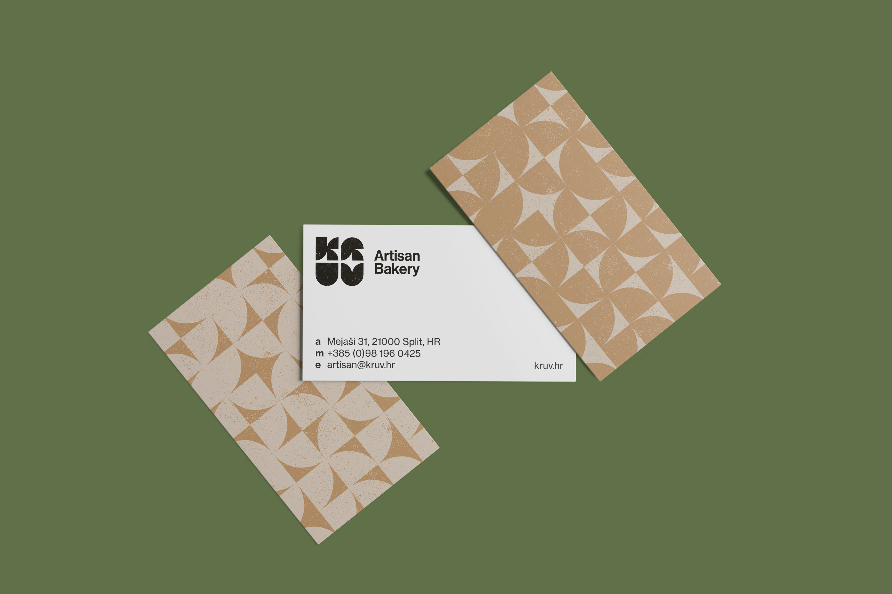
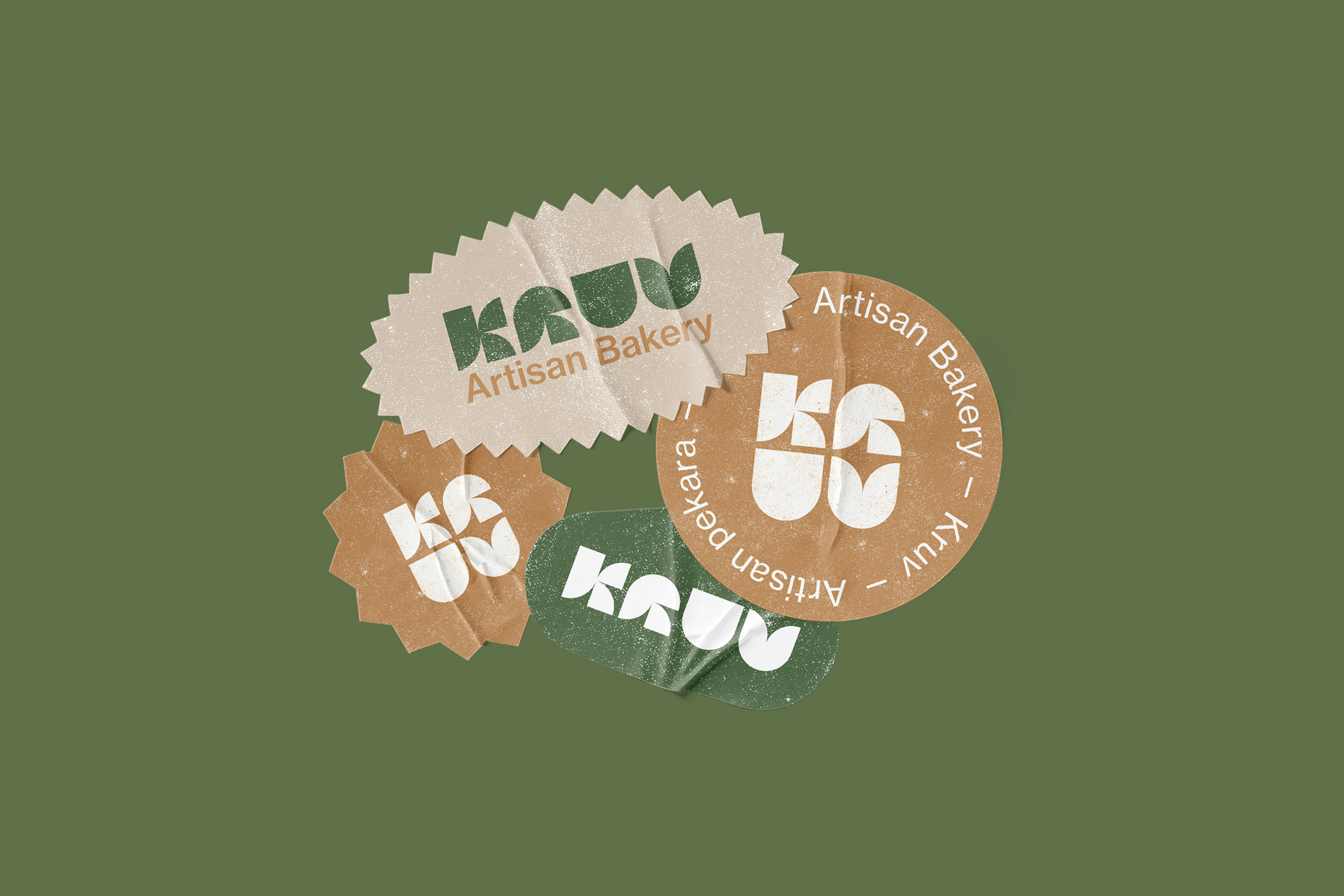
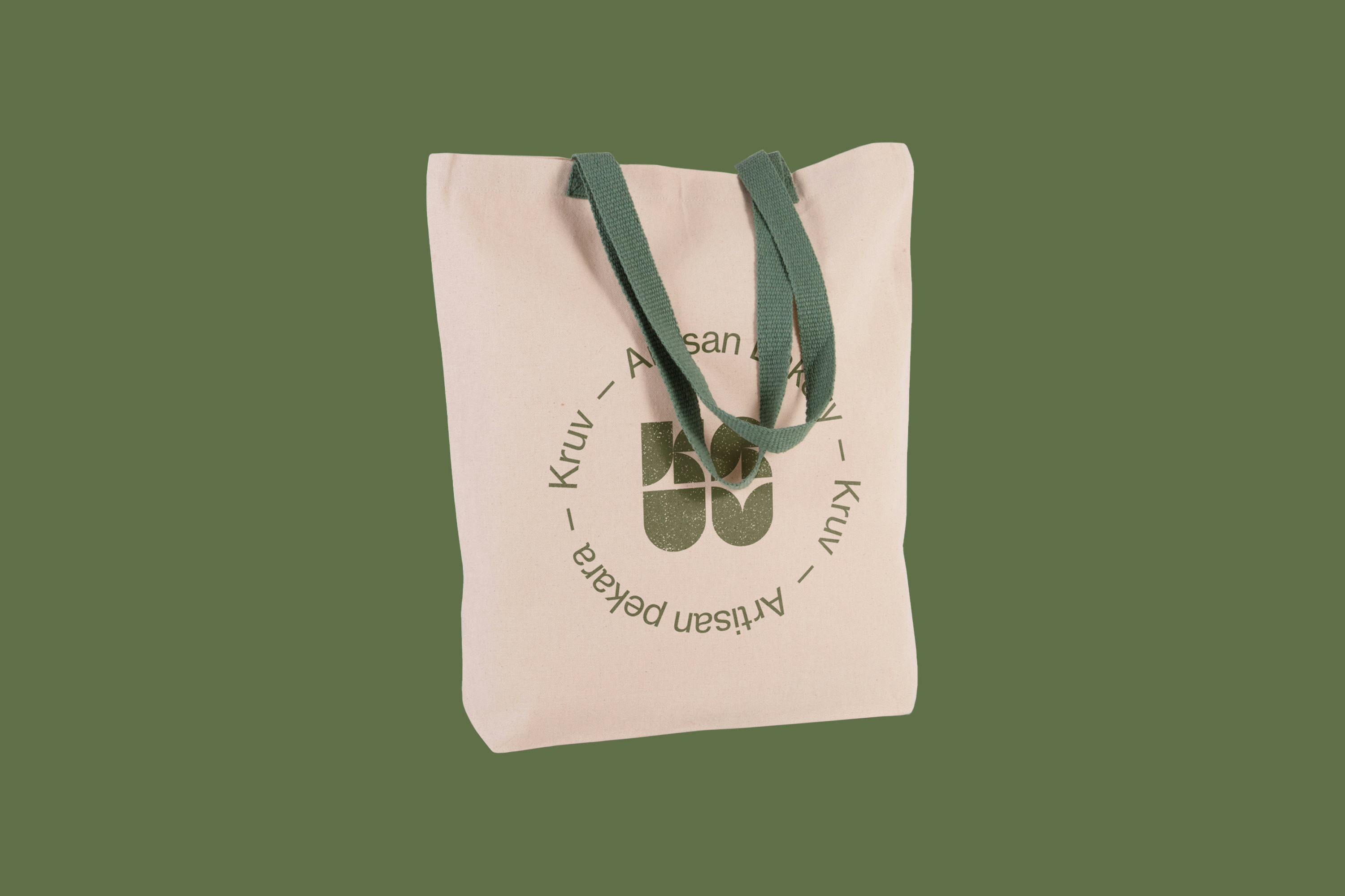
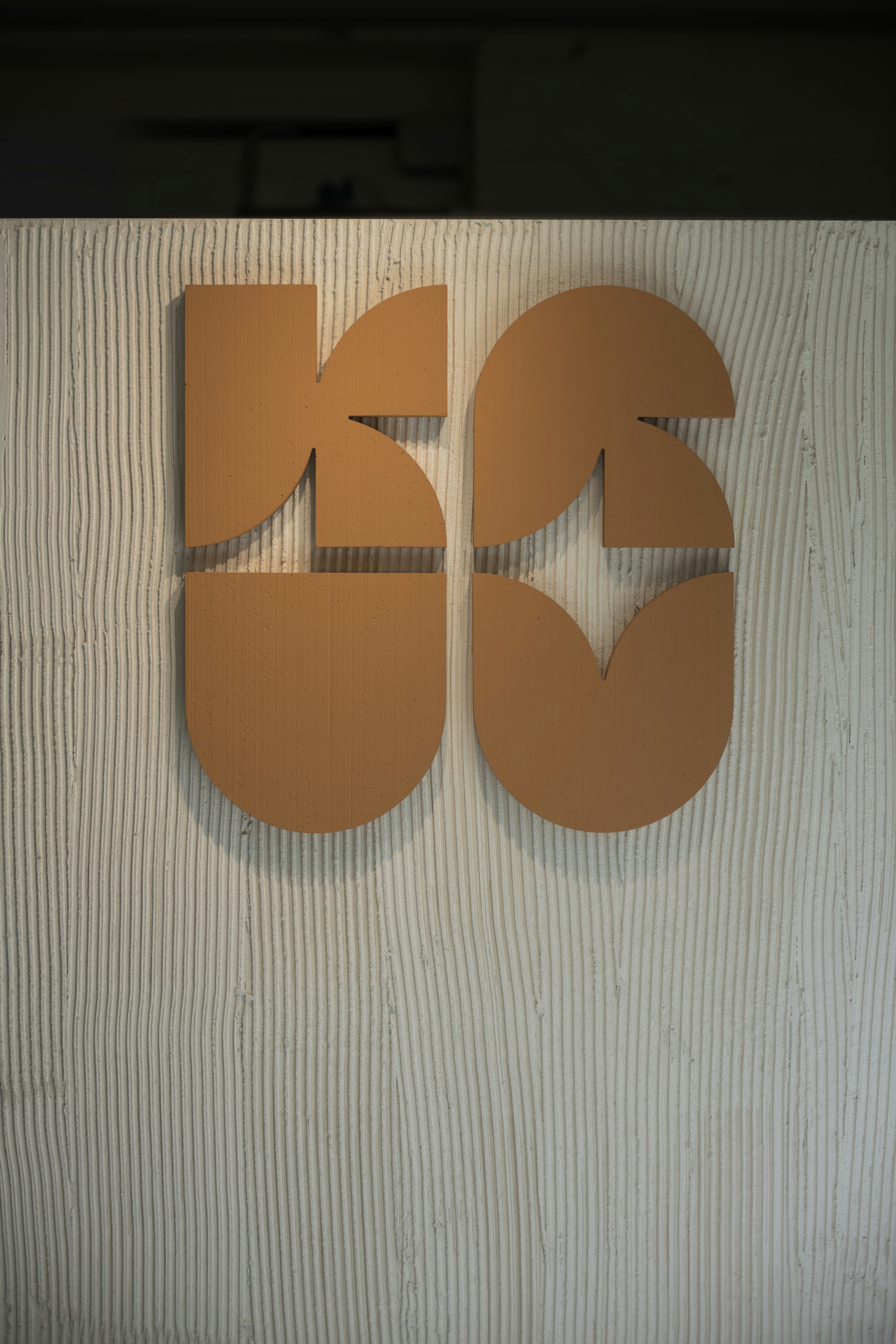
Visual Identity
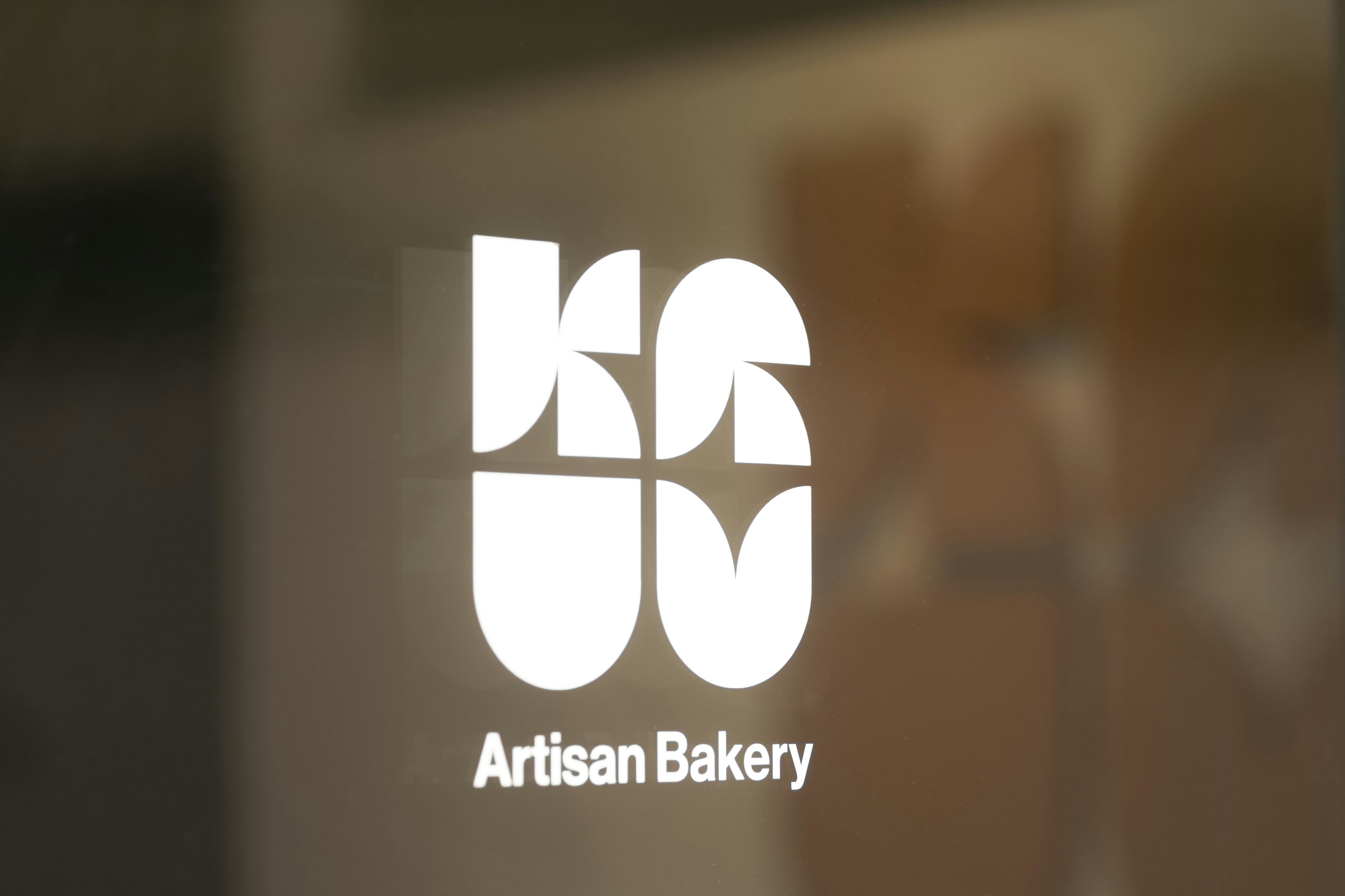
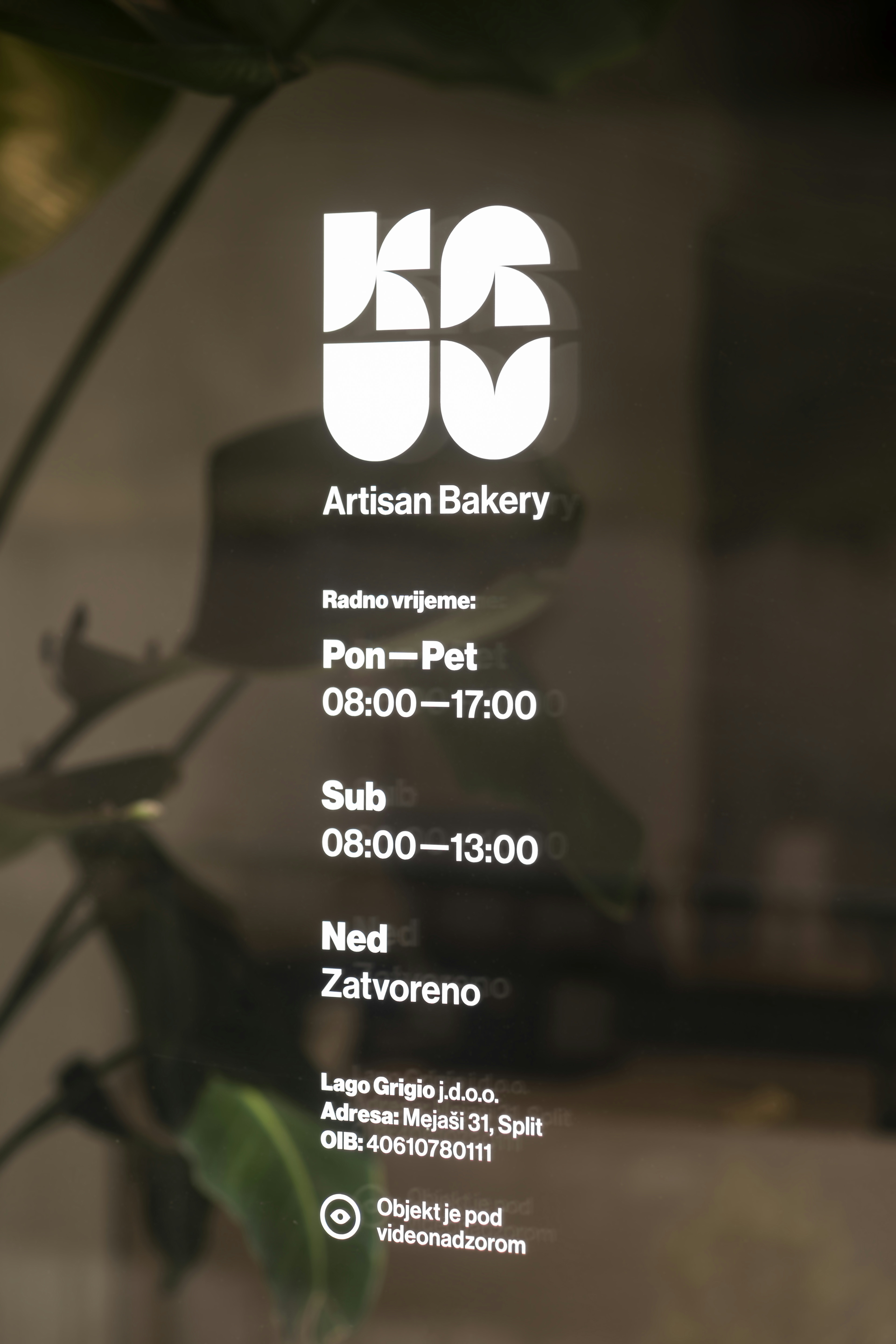
KRUV
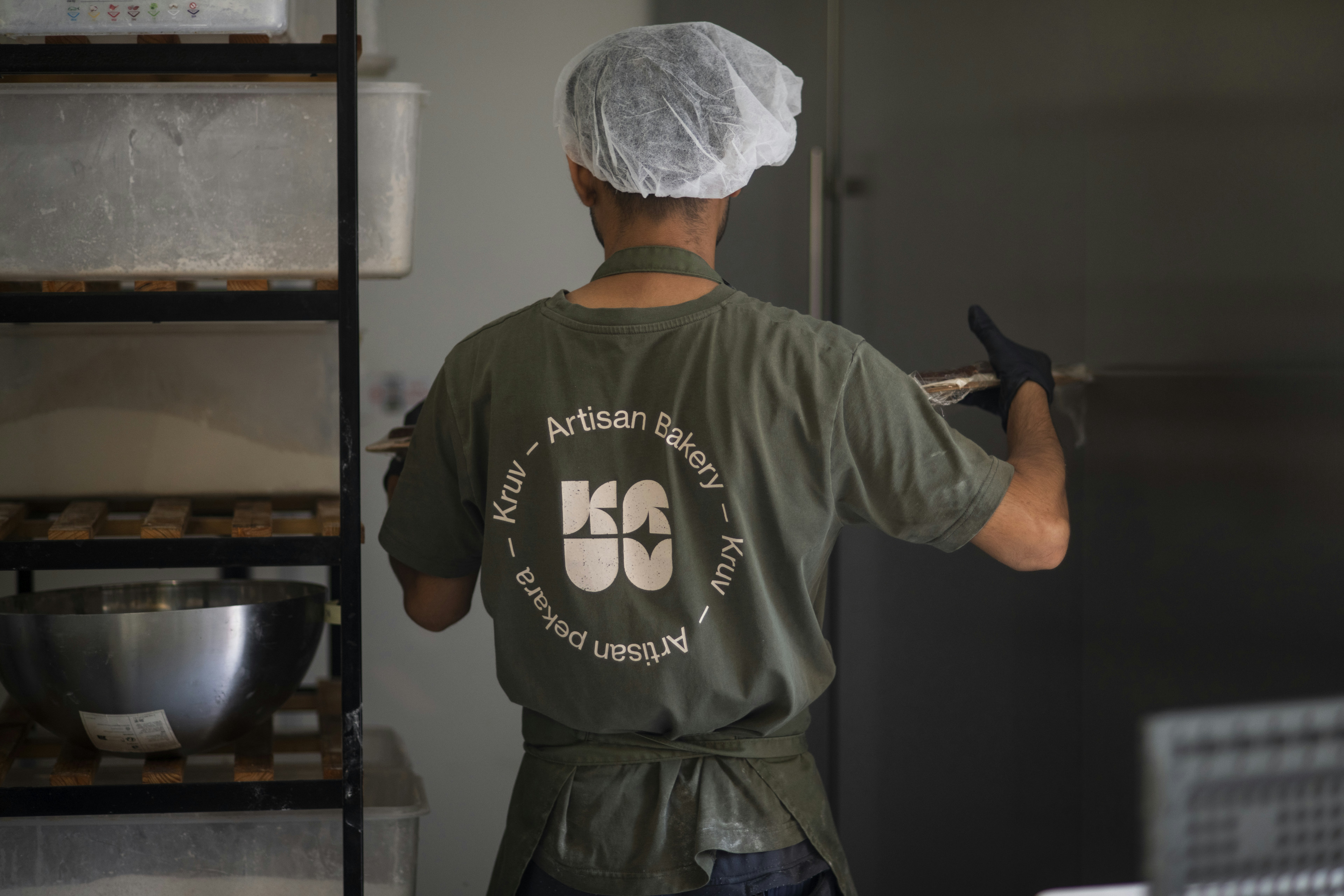
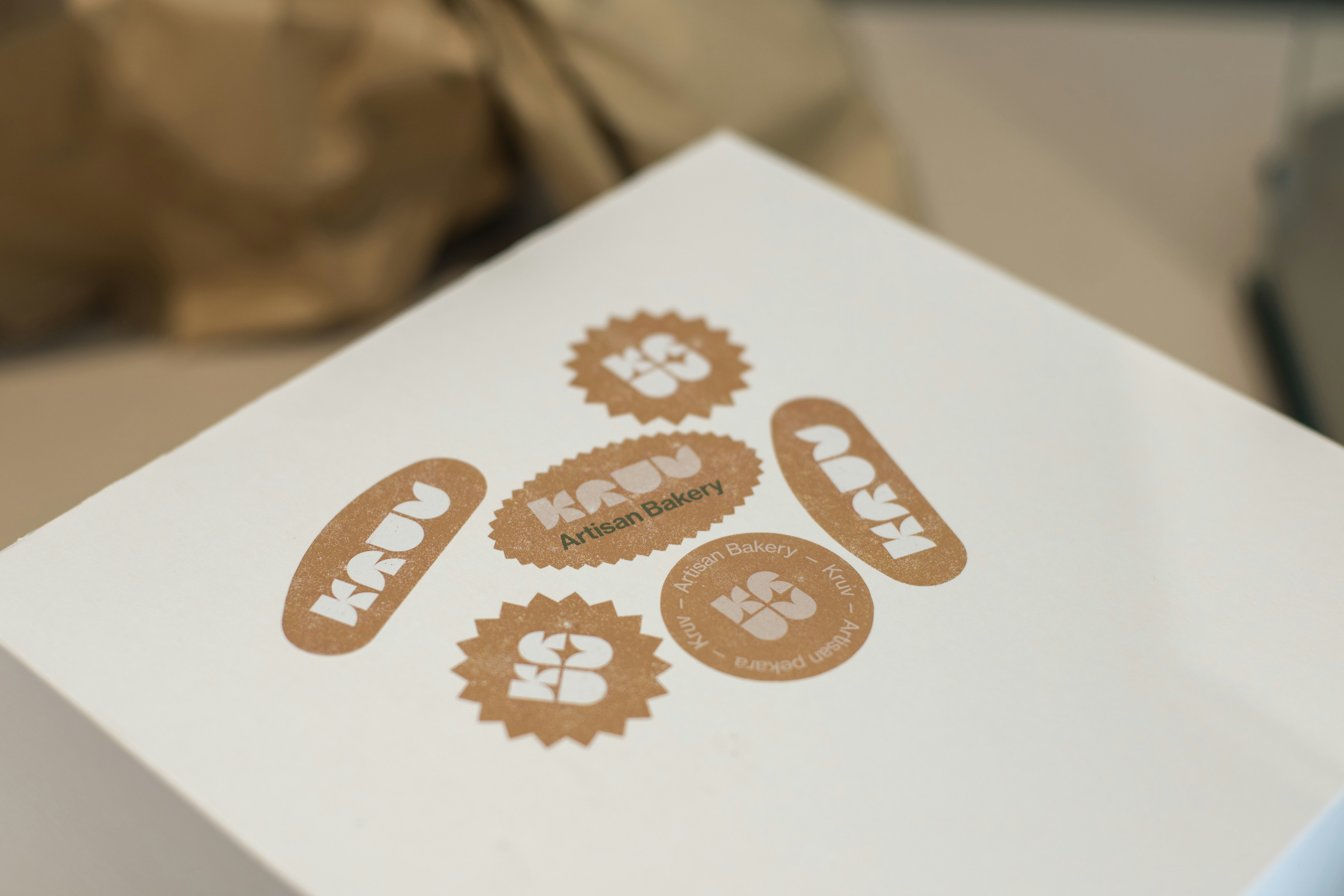
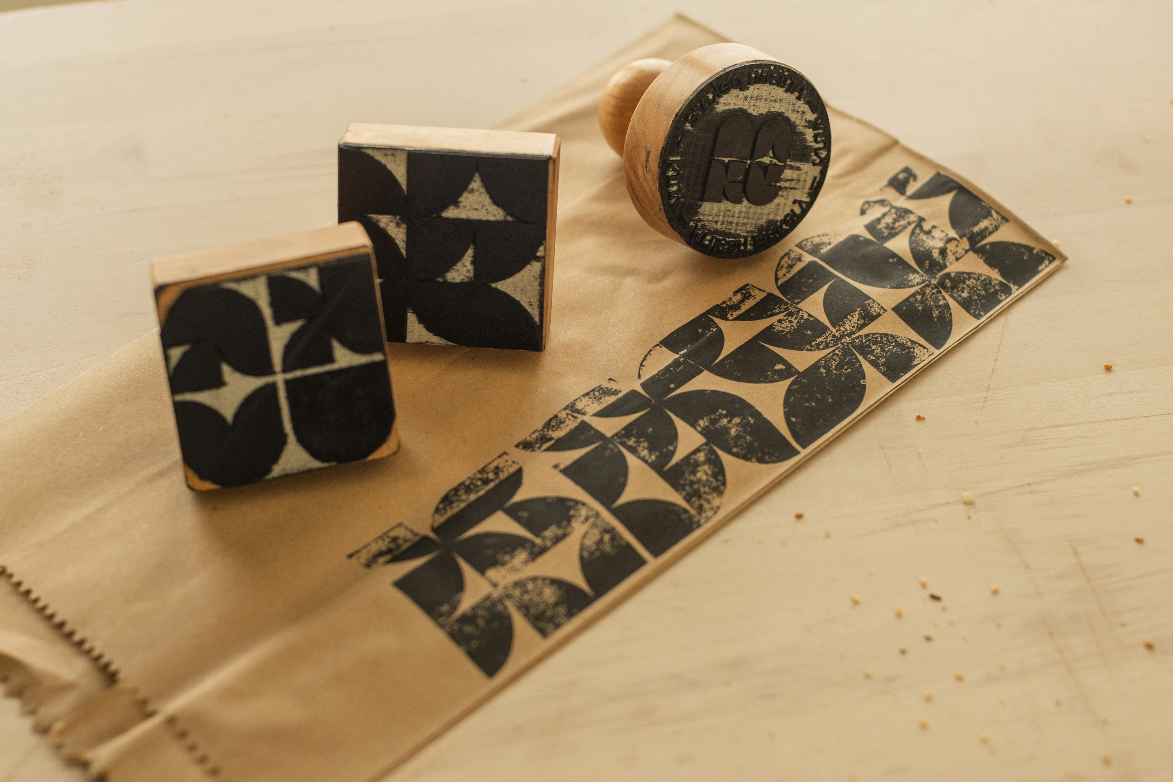
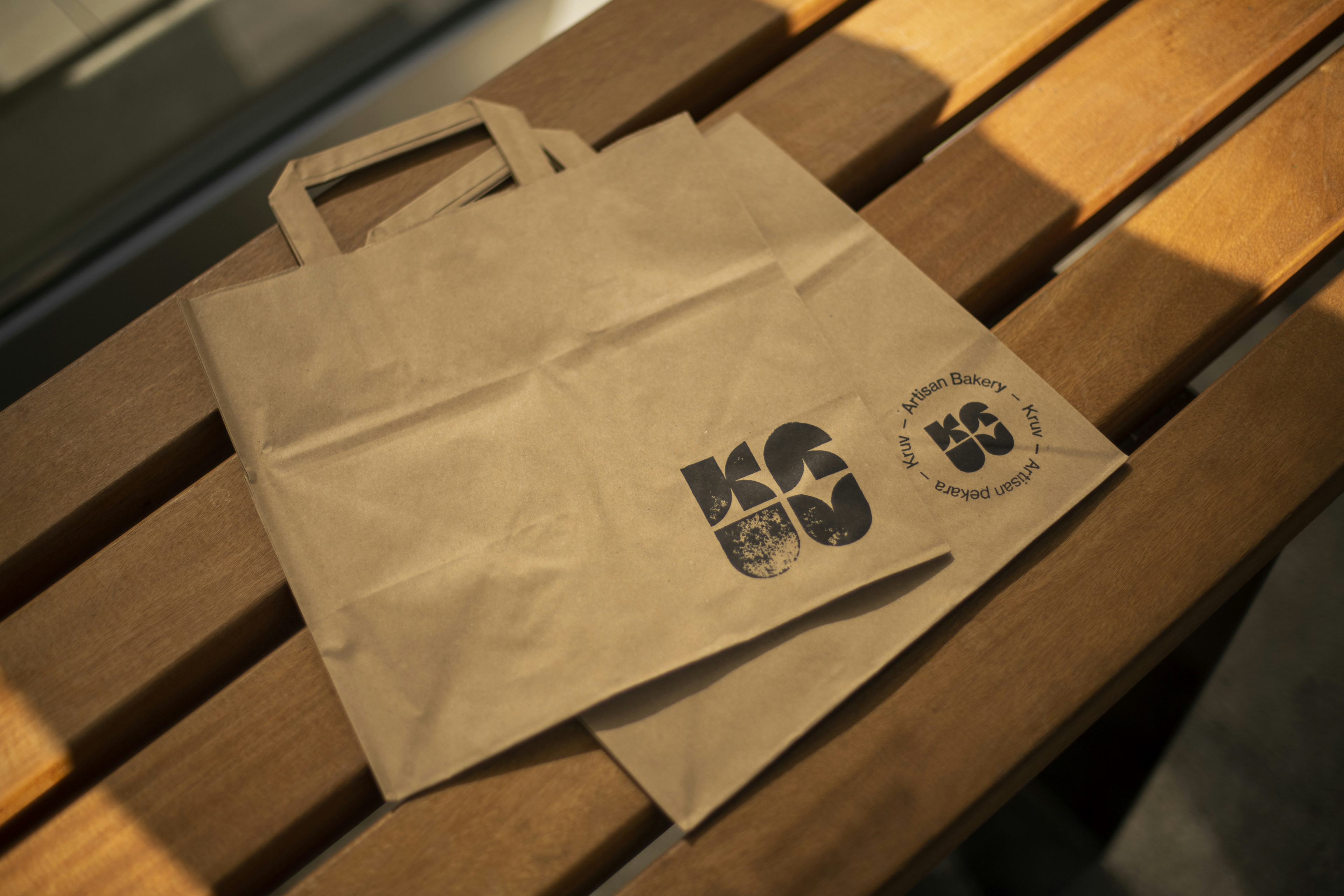
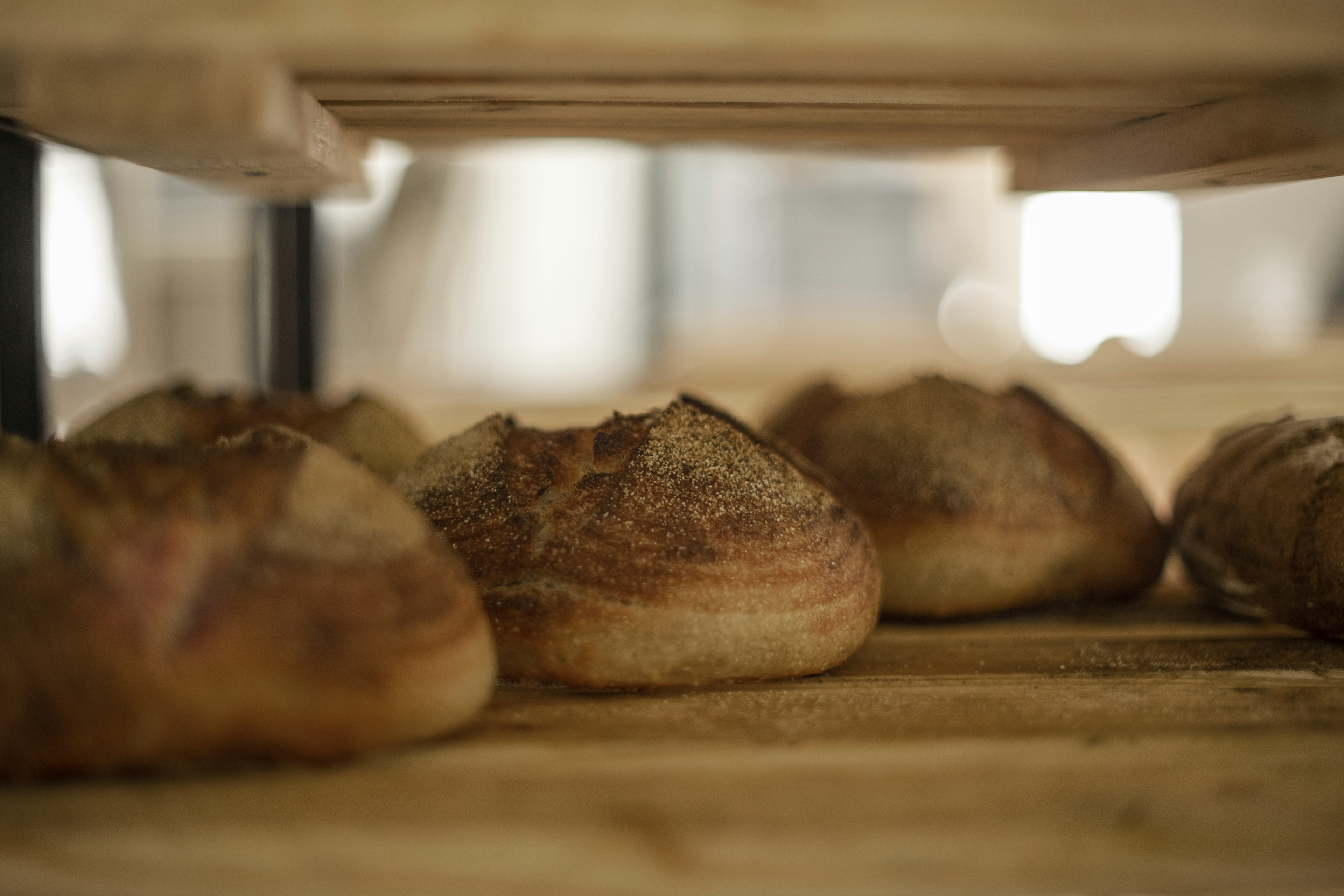
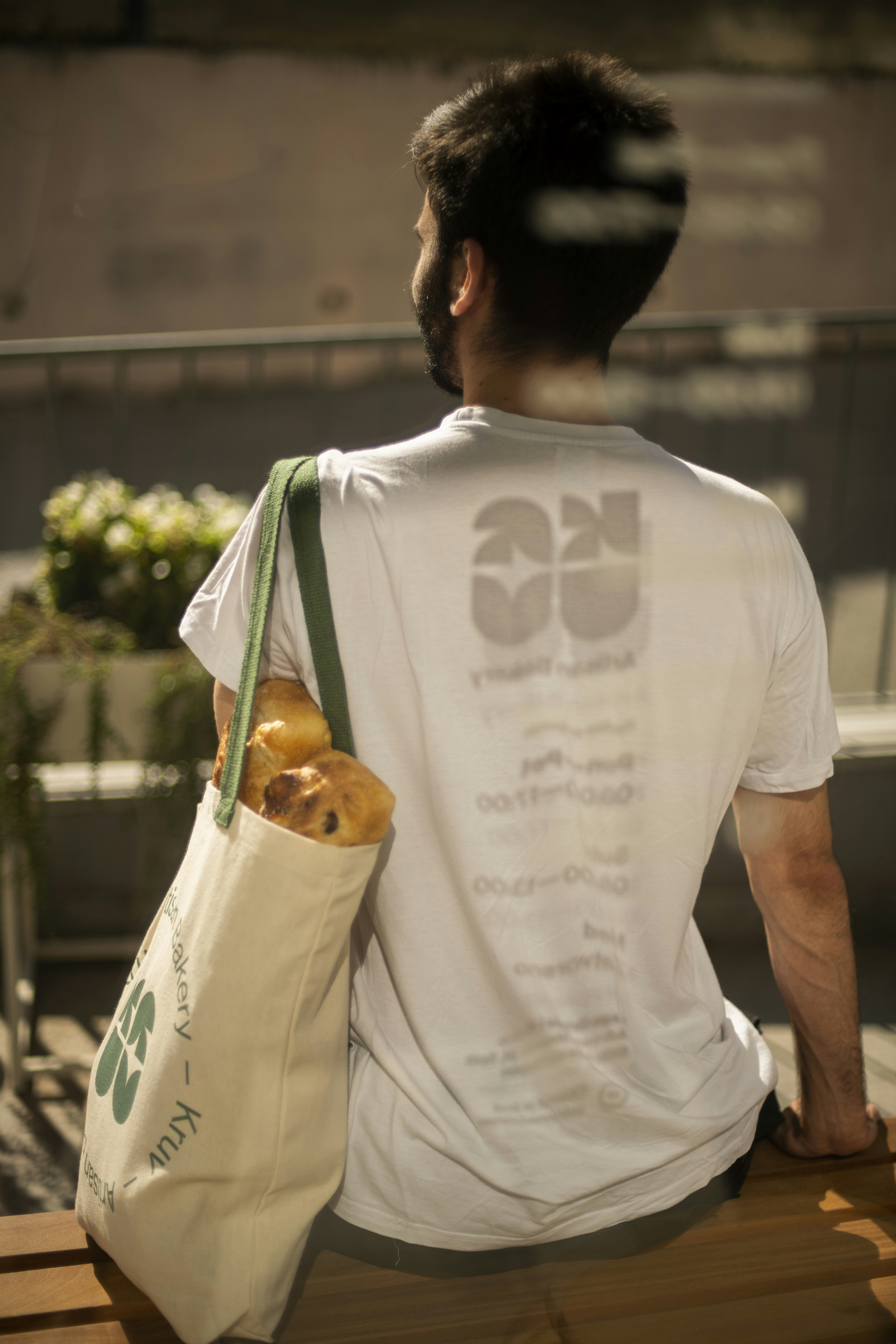
The design of the artisan bakery Kruv is based on a rudimentary story about bread. The idea is based on two loaves of bread that are divided into letter symbols.
On a subconscious level, certain letter shapes can also evoke an ear of wheat. The concept is as basic as the brand name itself, which originates from the Dalmatian region where the word bread softens into Kruv.
- Collaborator
- Bruno Dubravec
- Client
- Lago Grigio
Related Projects
All Projects
