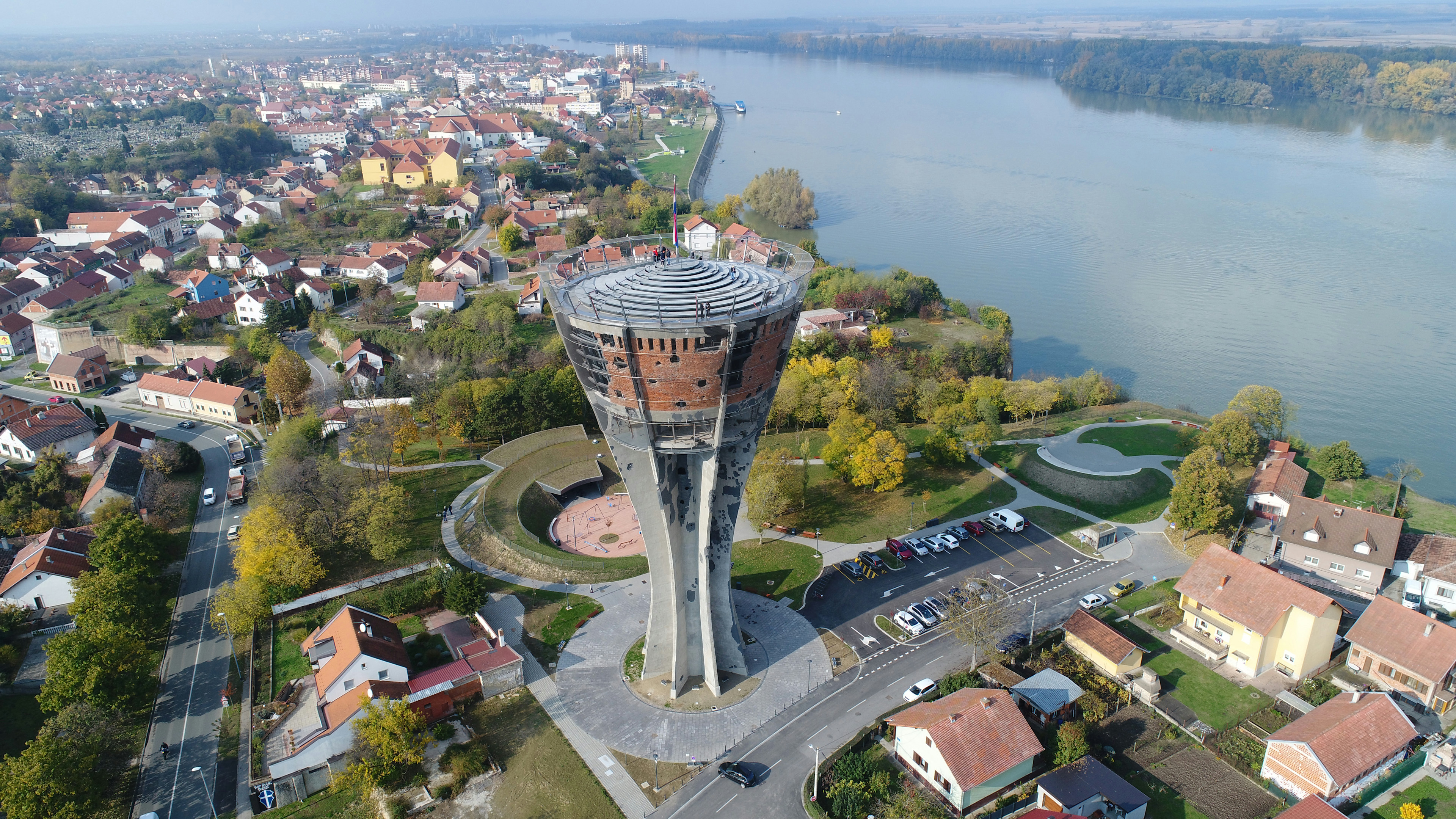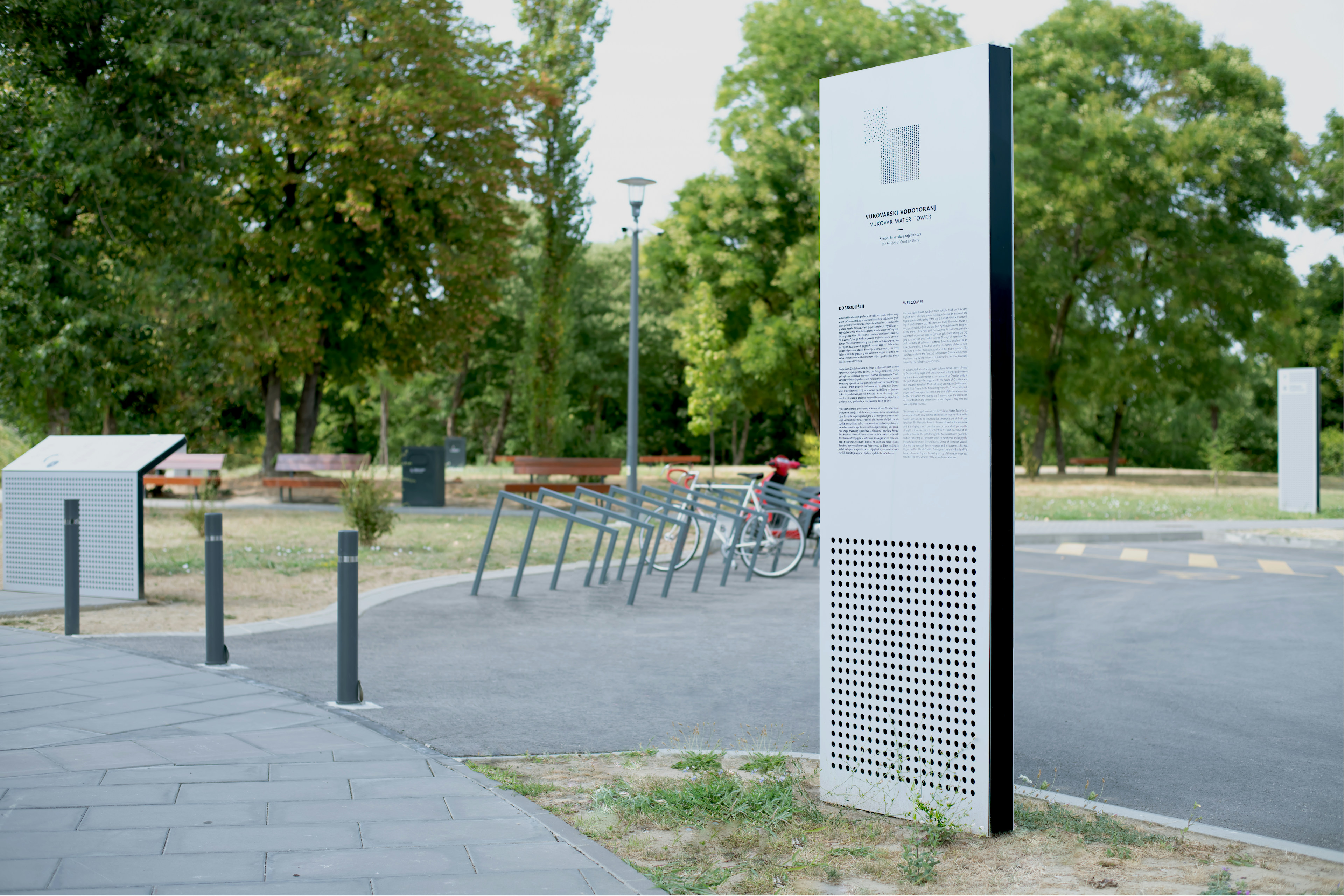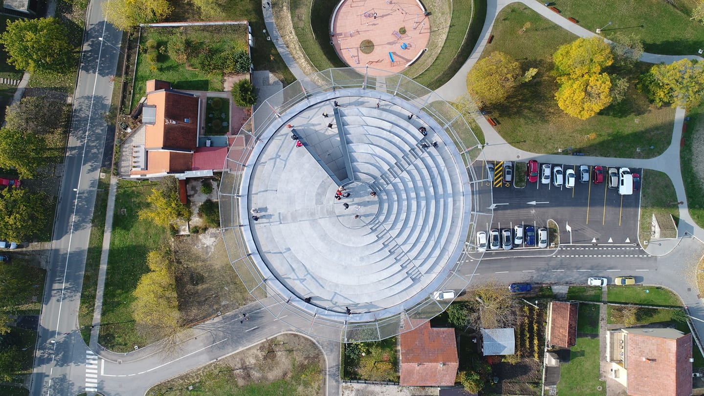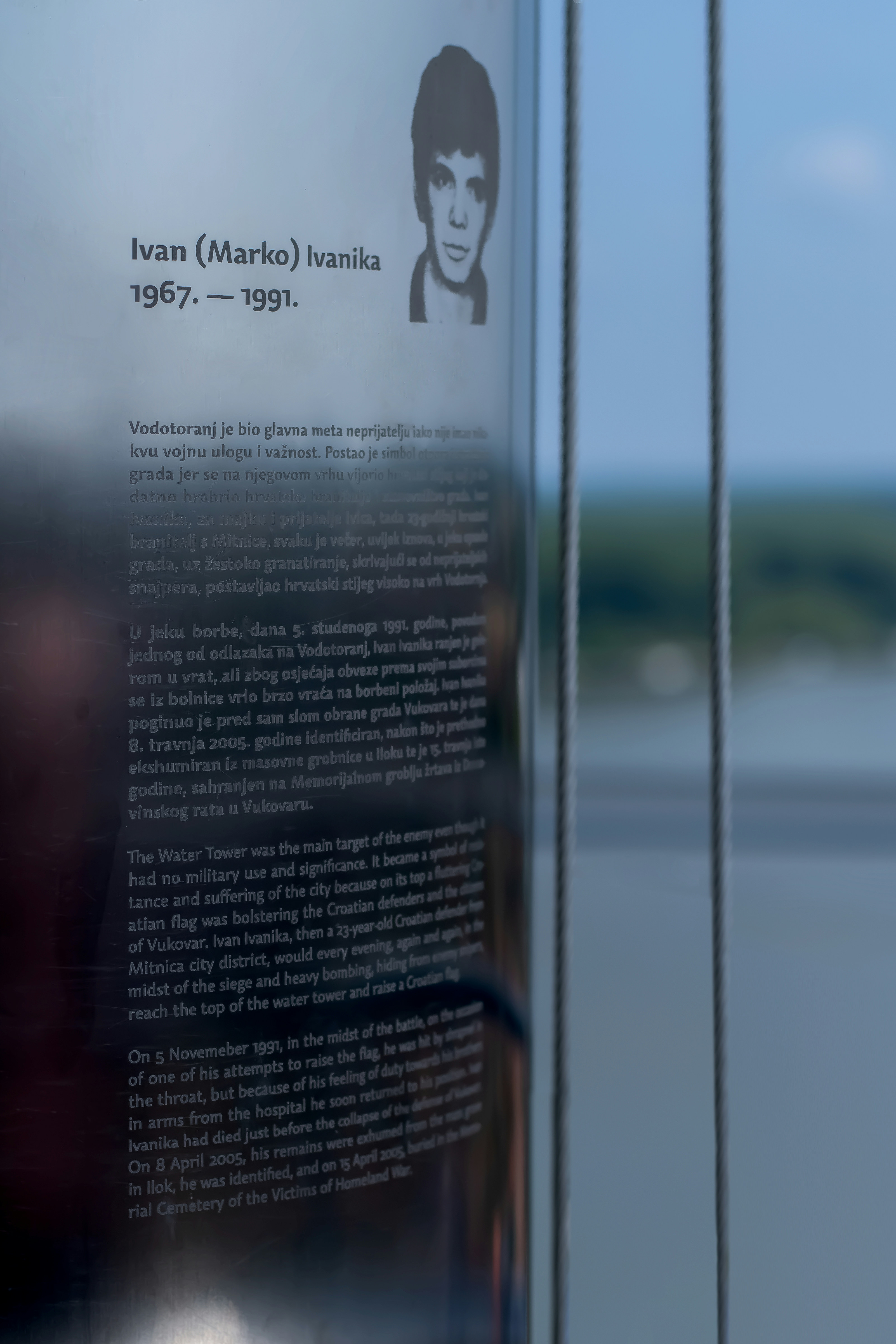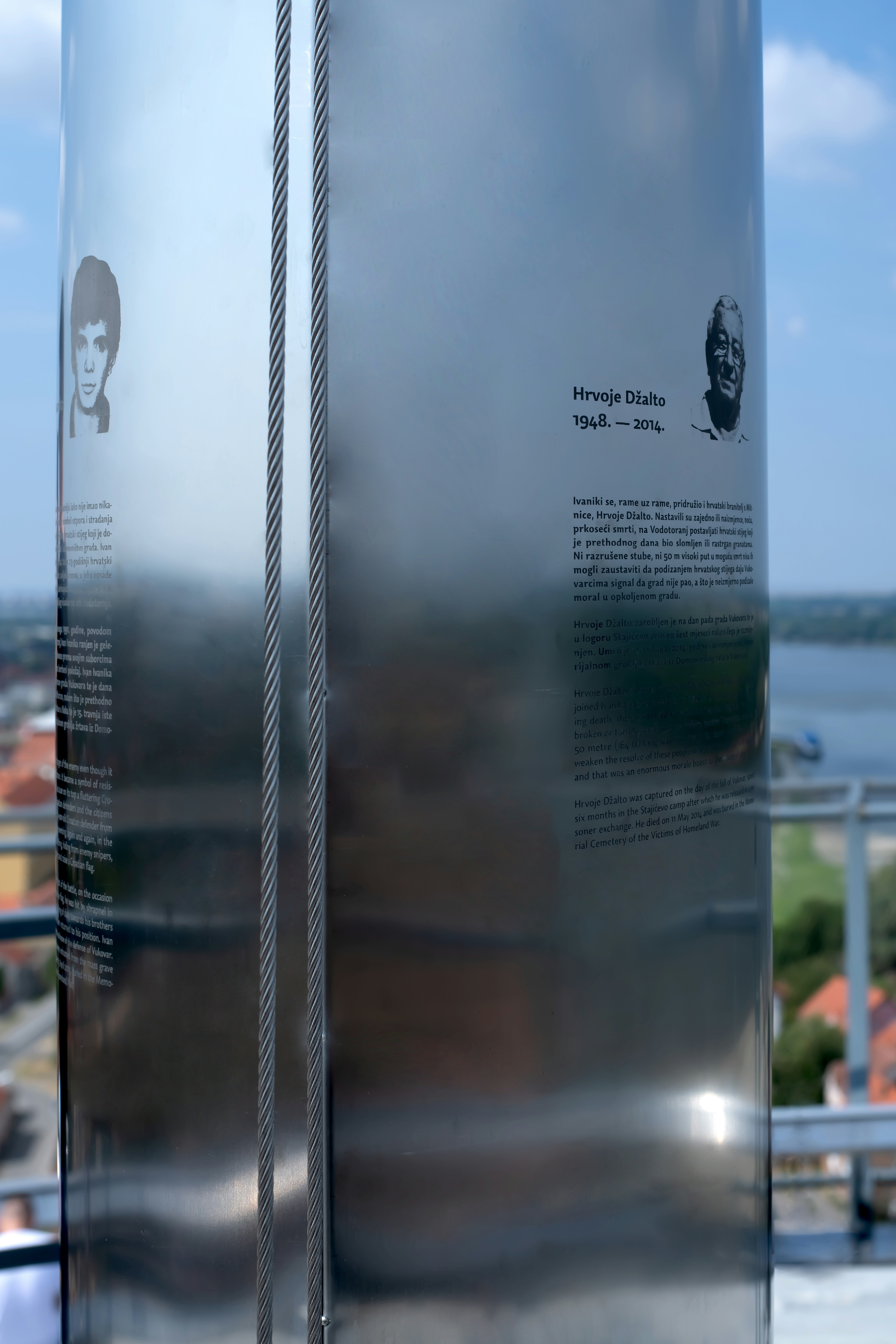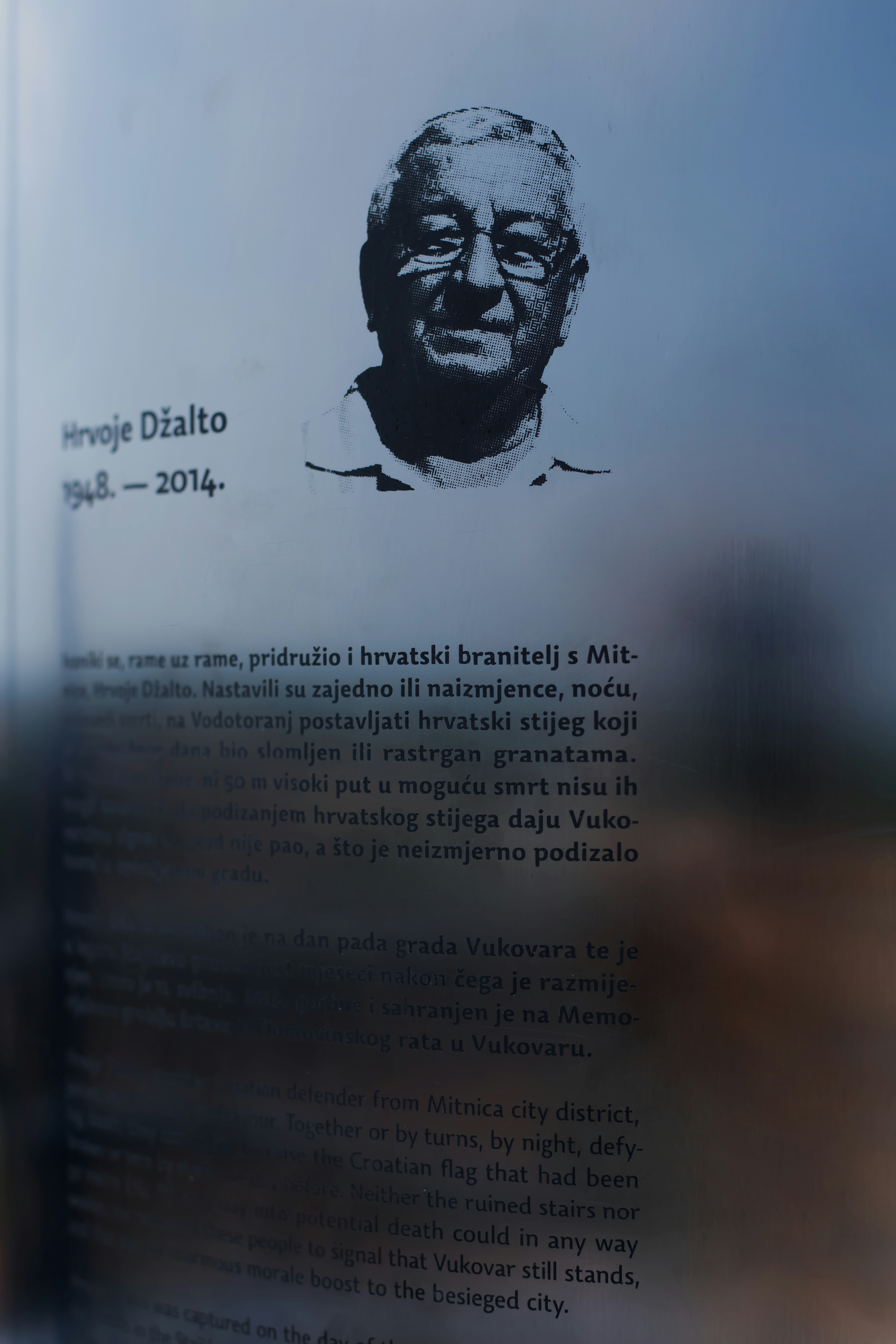
Vukovar Water Tower
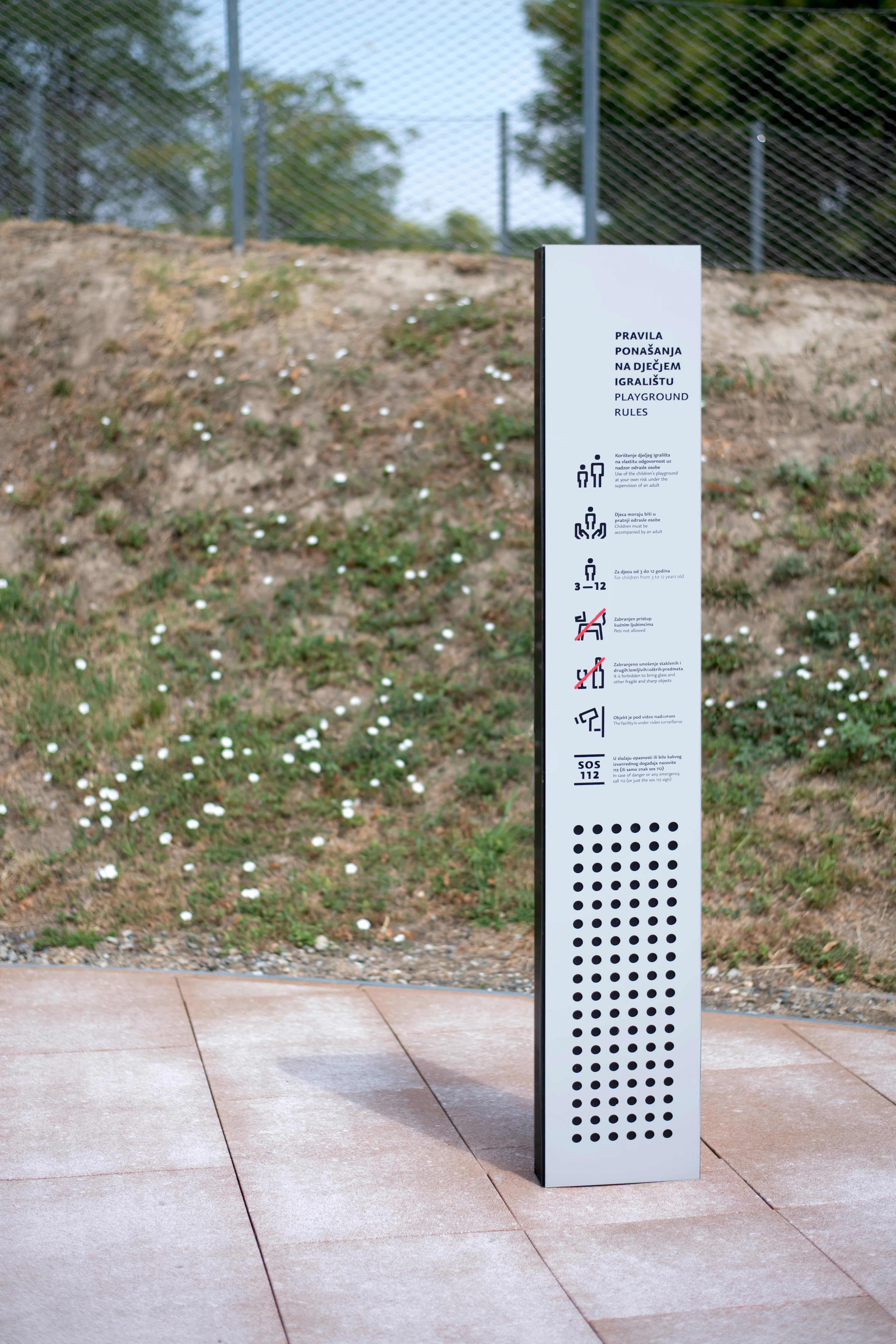
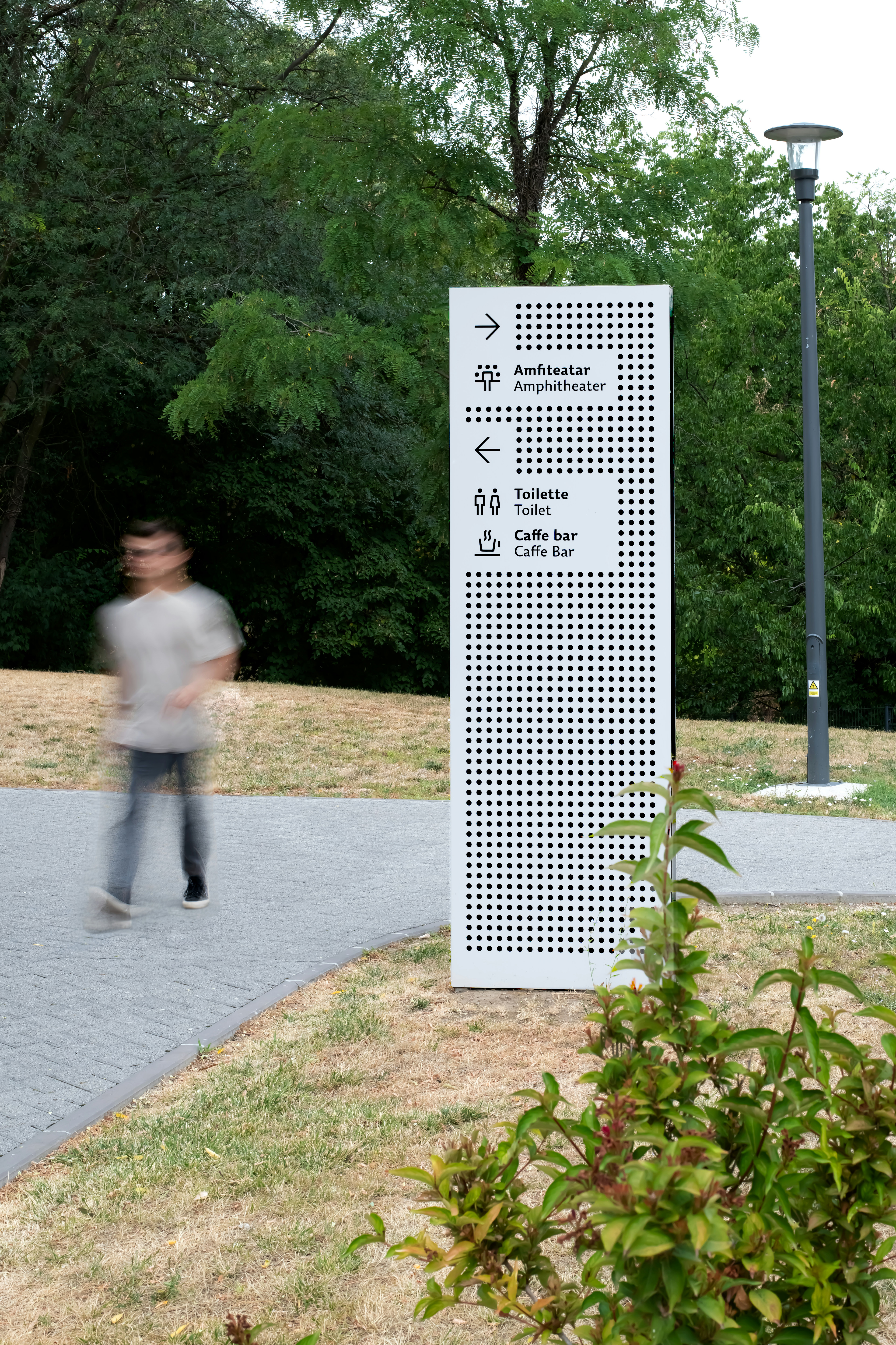
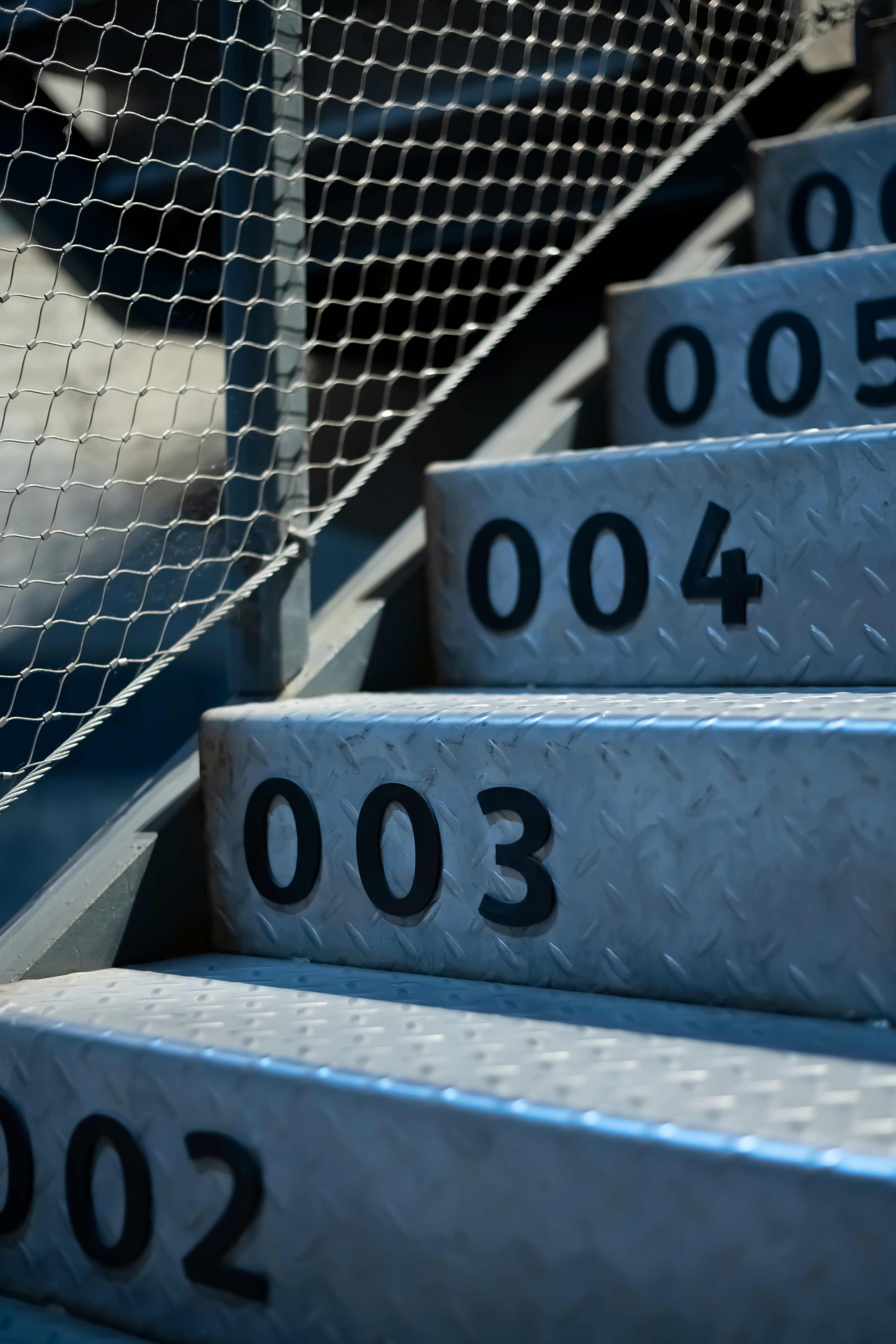
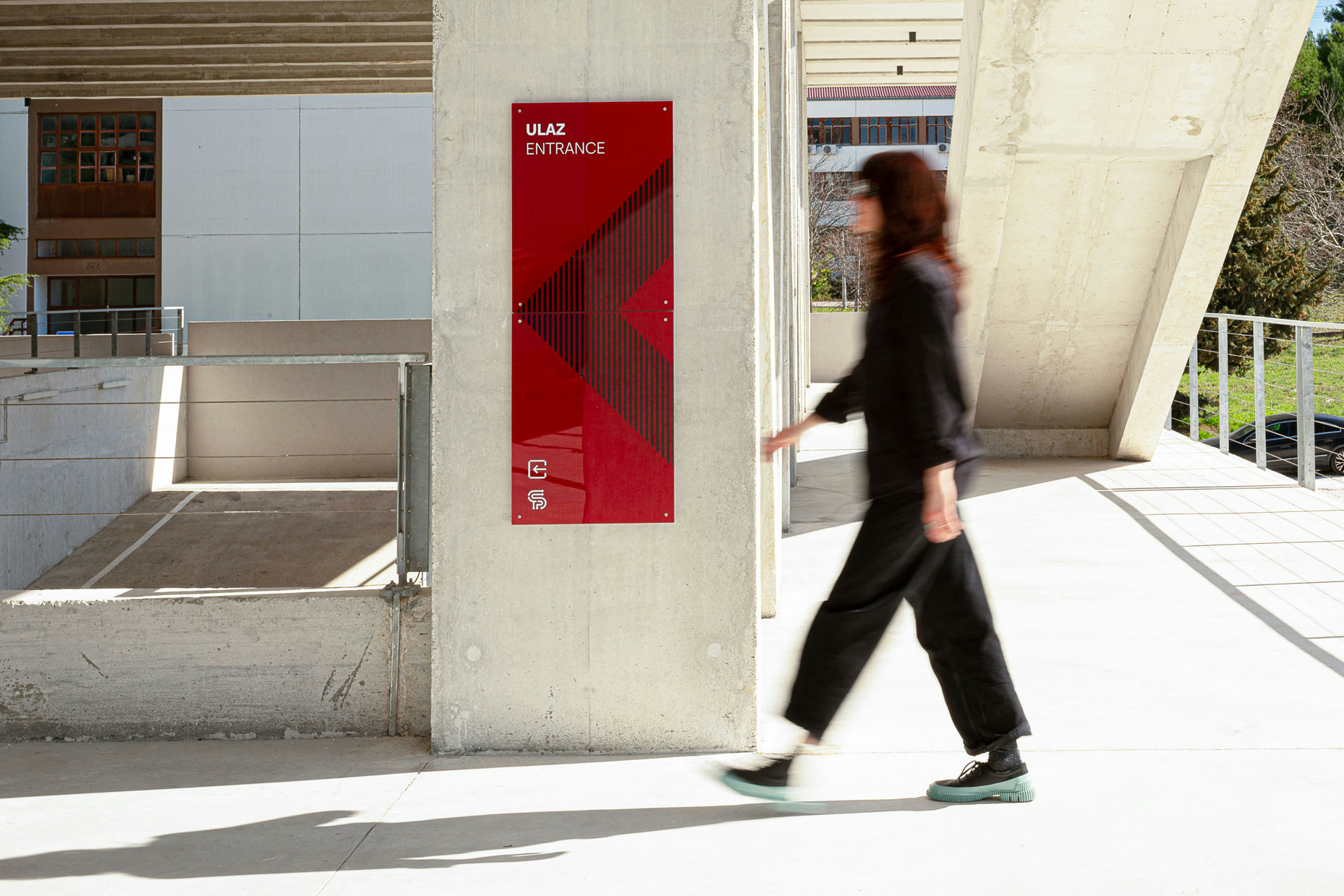
The basic concept of the signage design was inspired by a previously designed visual identity based on 650 direct hits from various weapons that the Water Tower endured during the Homeland War. Our idea was to transform the hits into circles and create a raster graphic from them that forms a symbol of diagonal squares that have long been accepted as a sublimated sign for the Republic of Croatia.
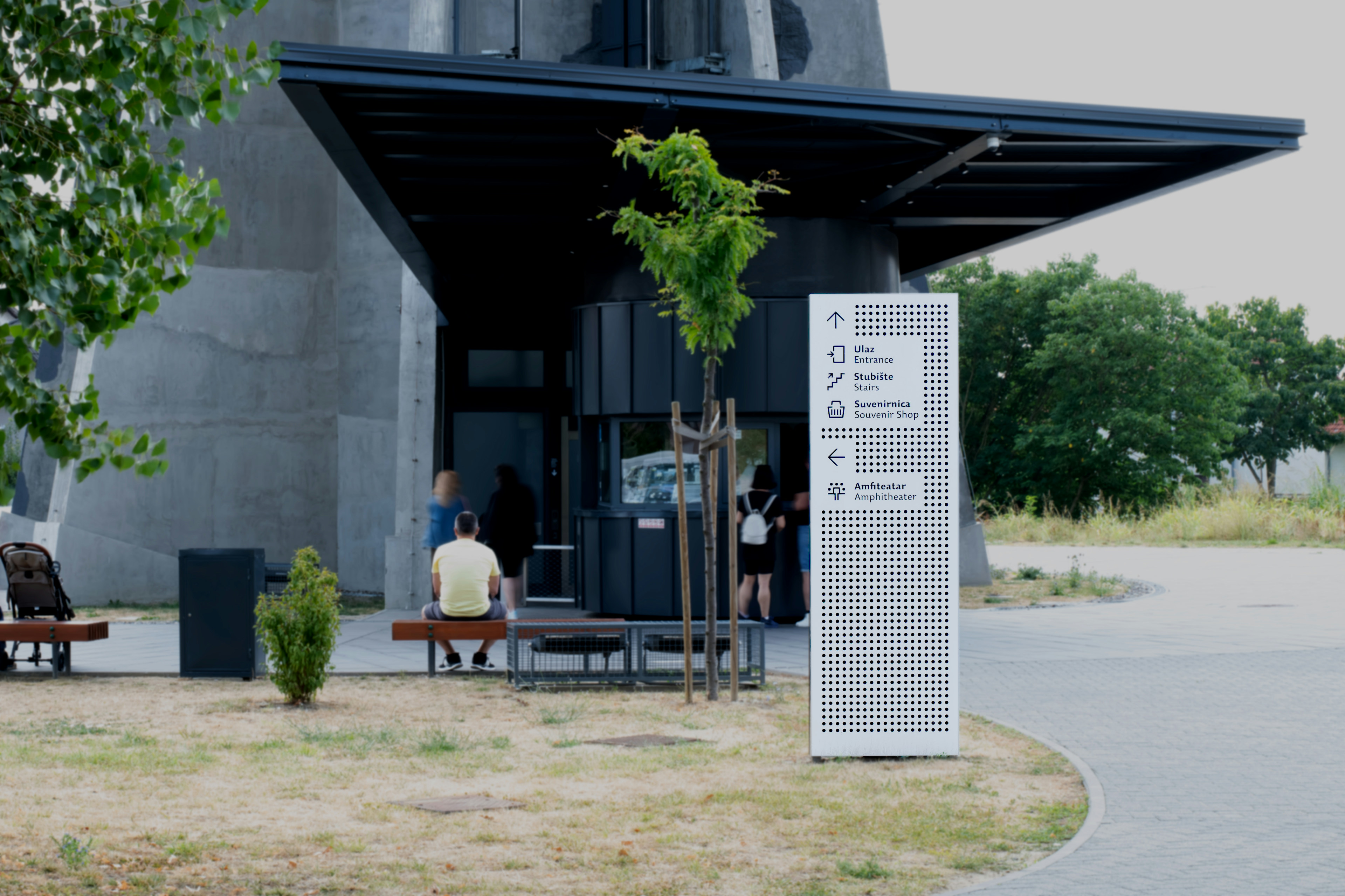
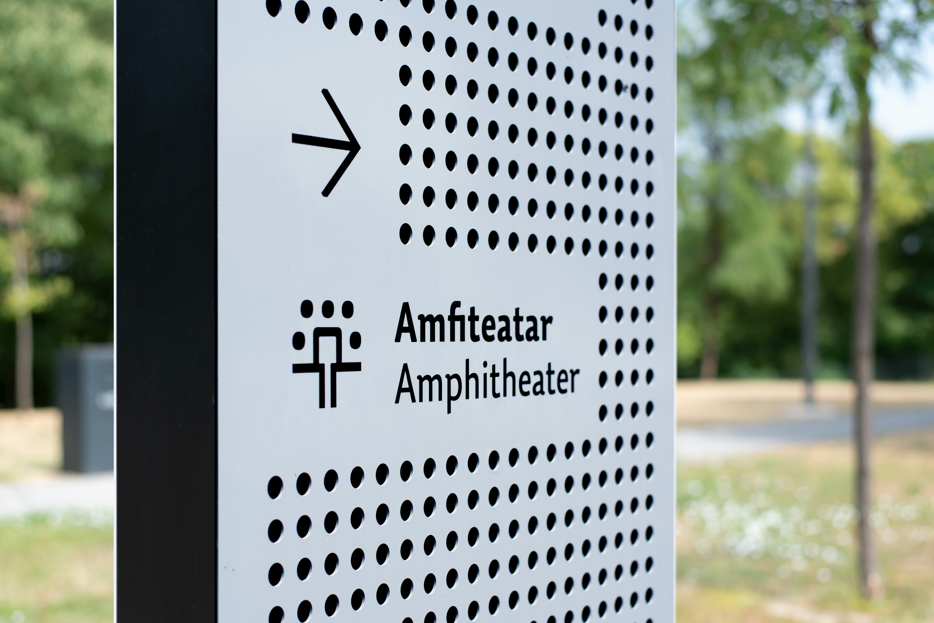
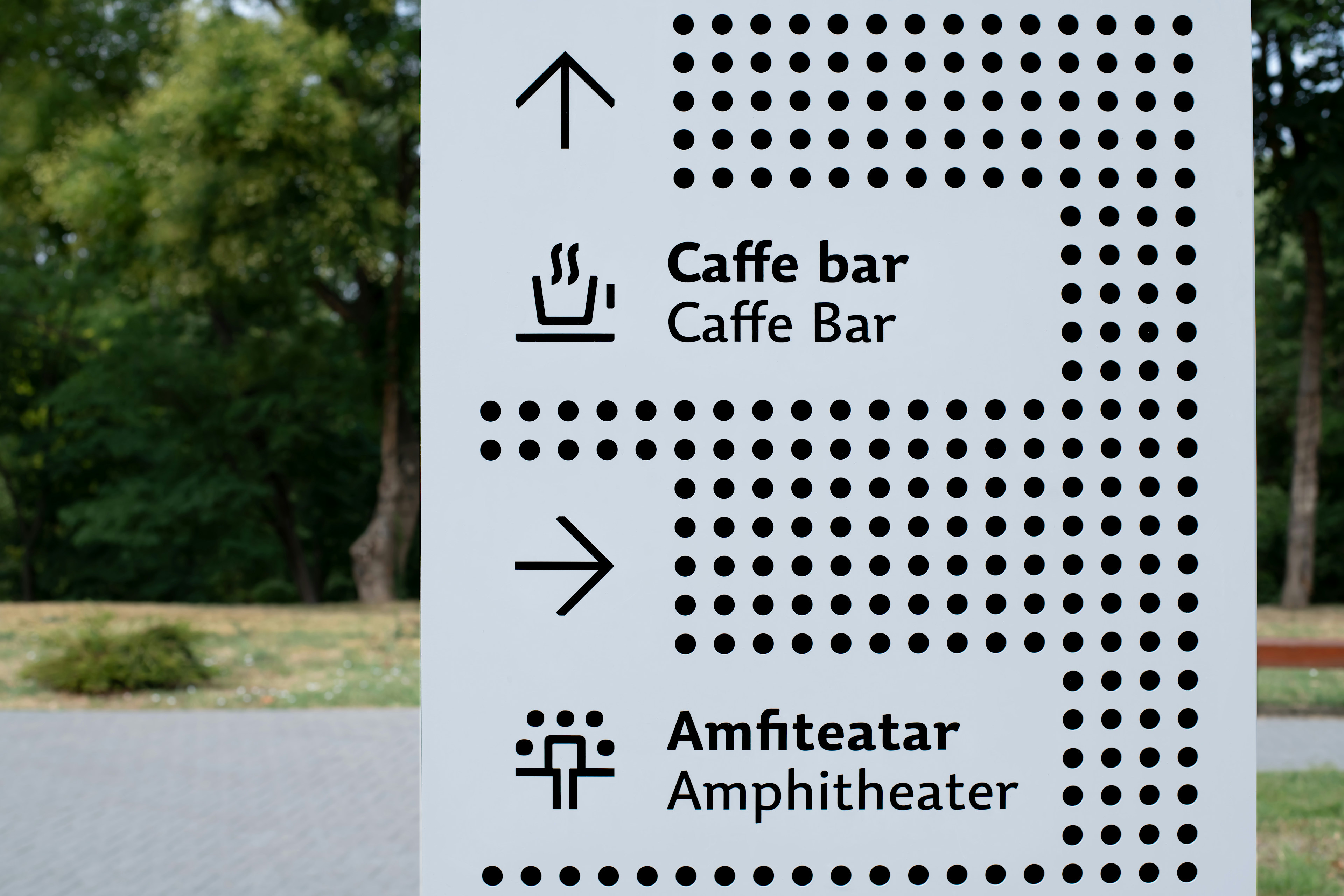
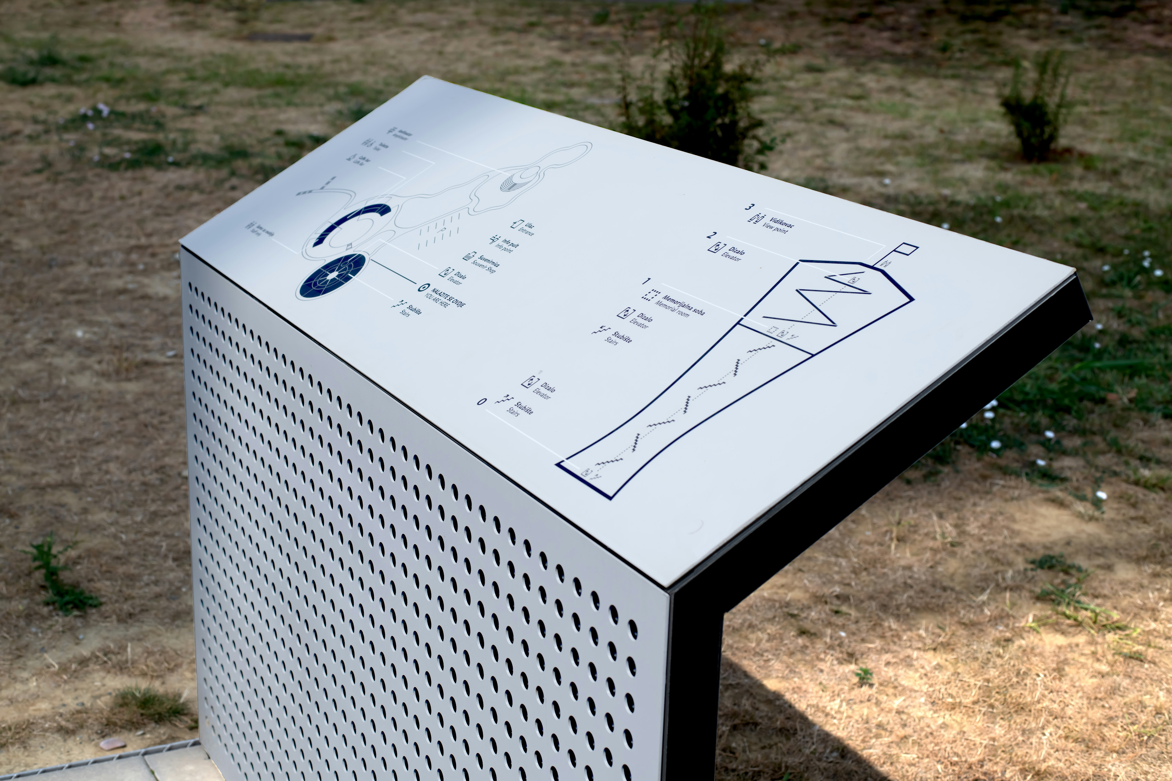
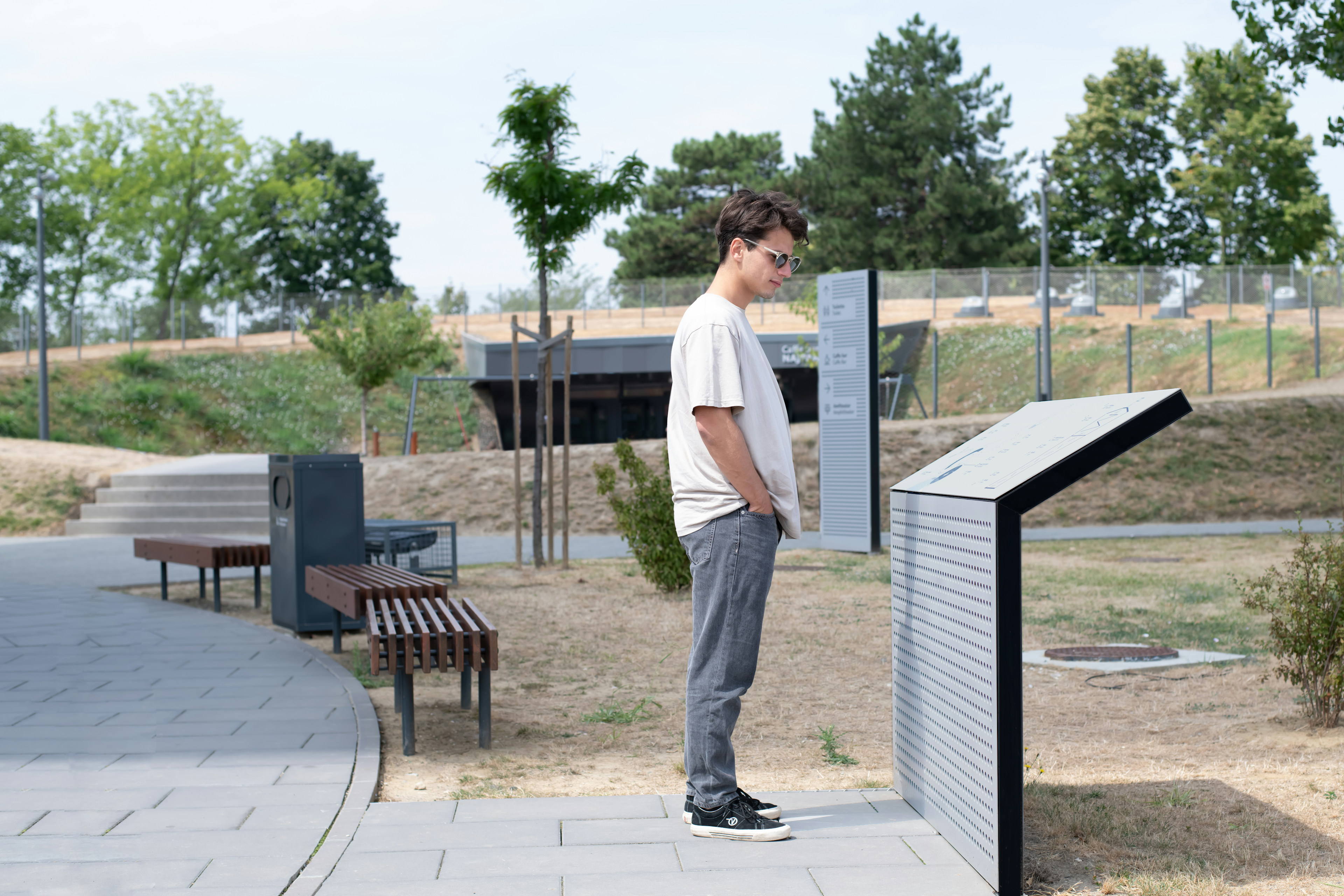
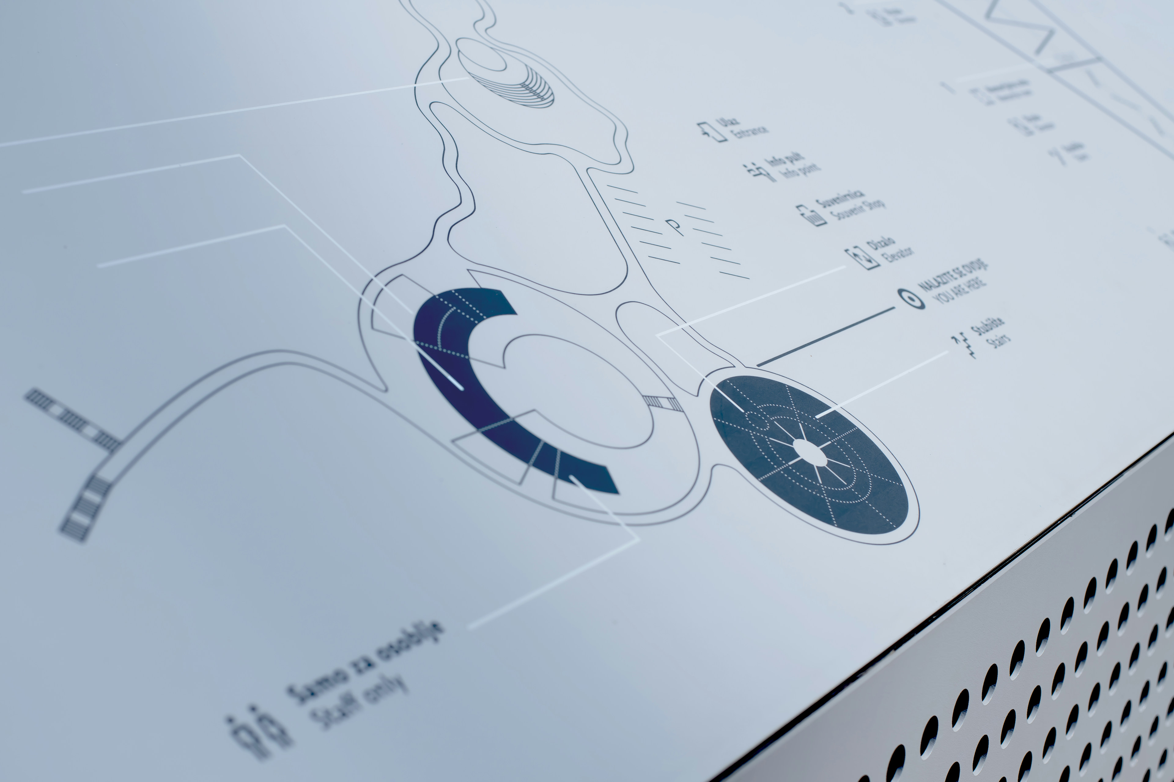
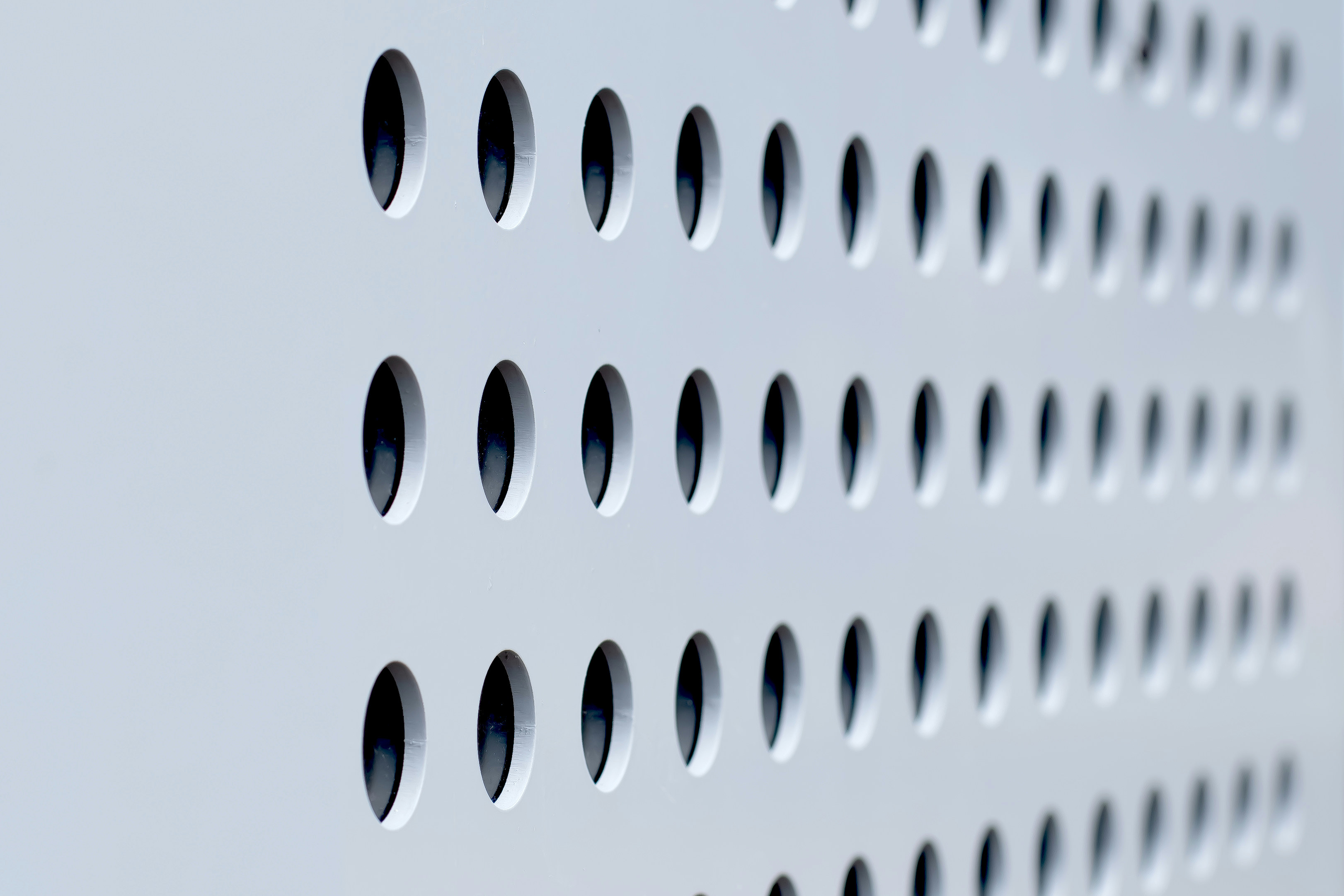
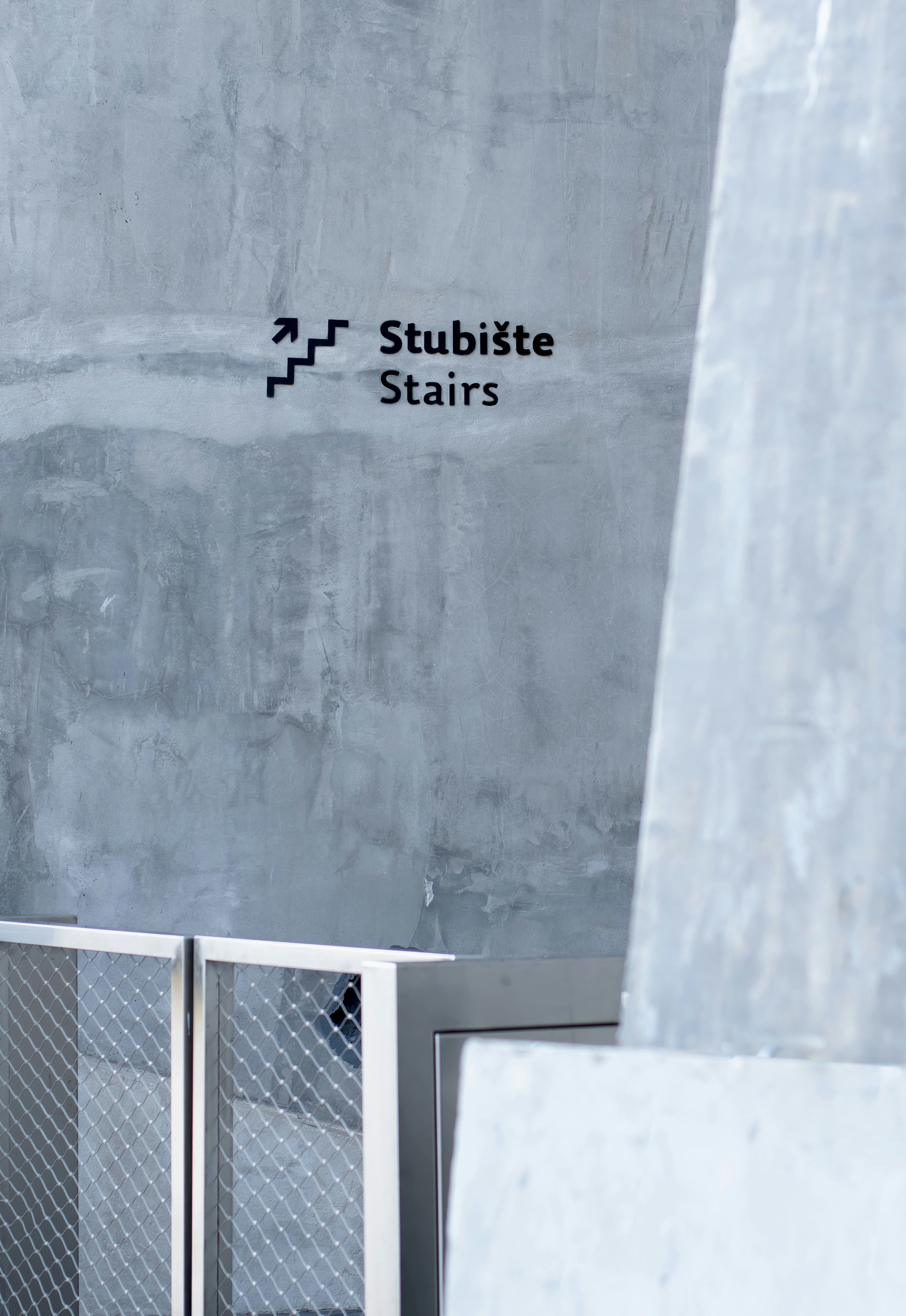
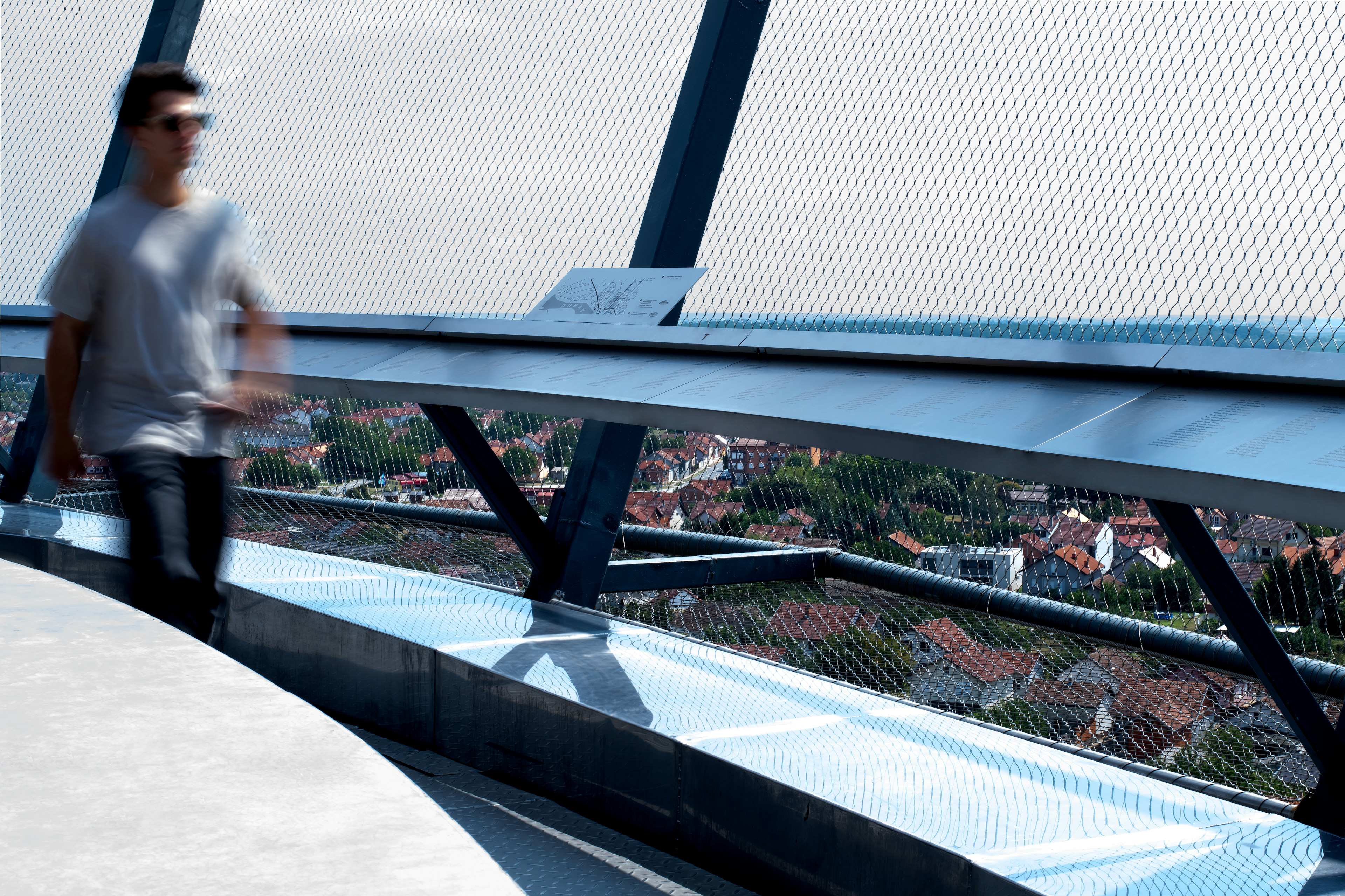
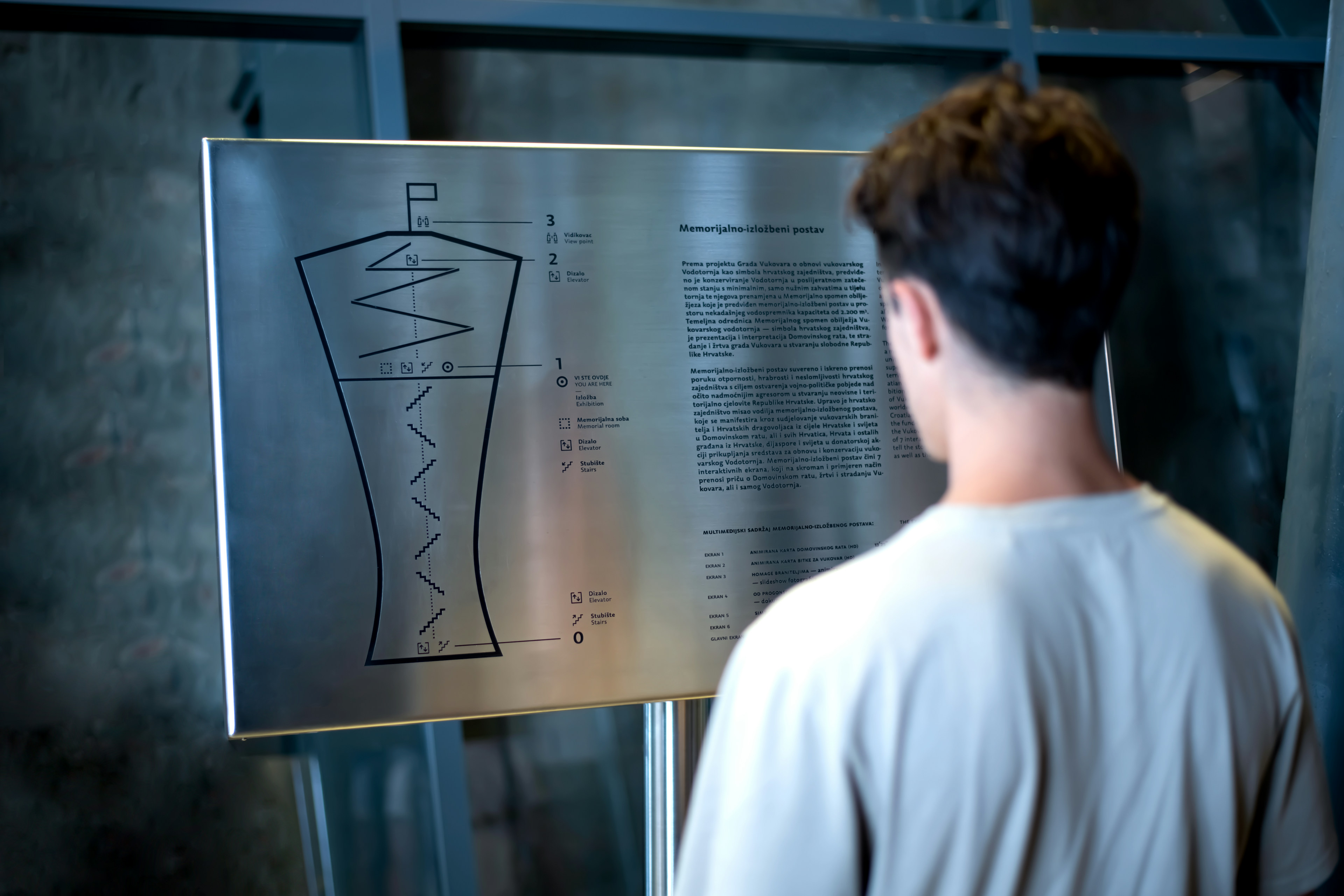
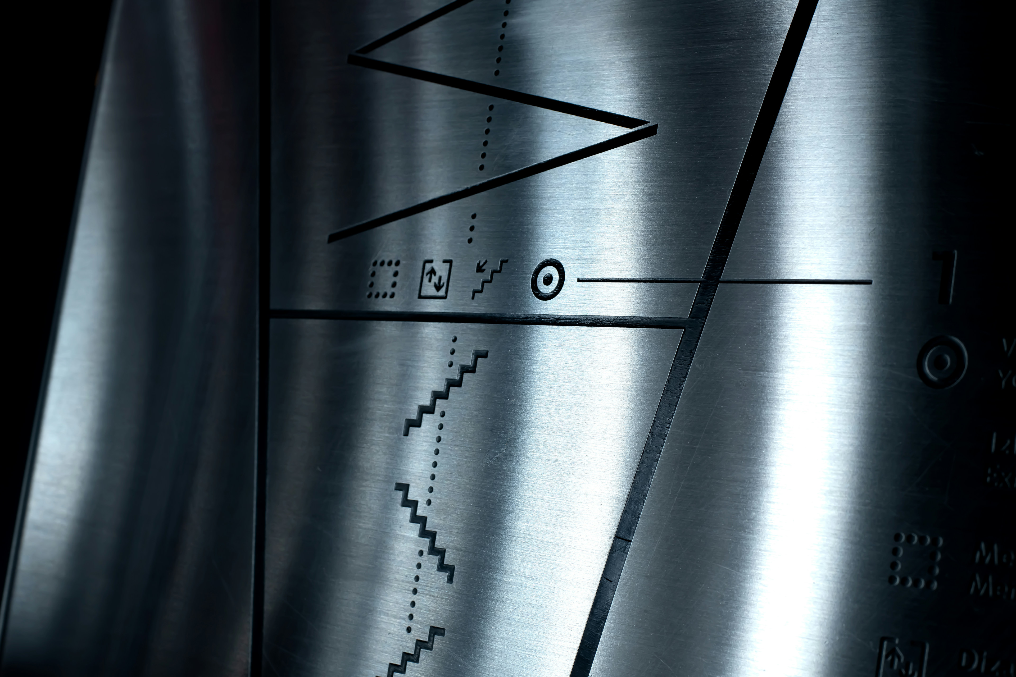
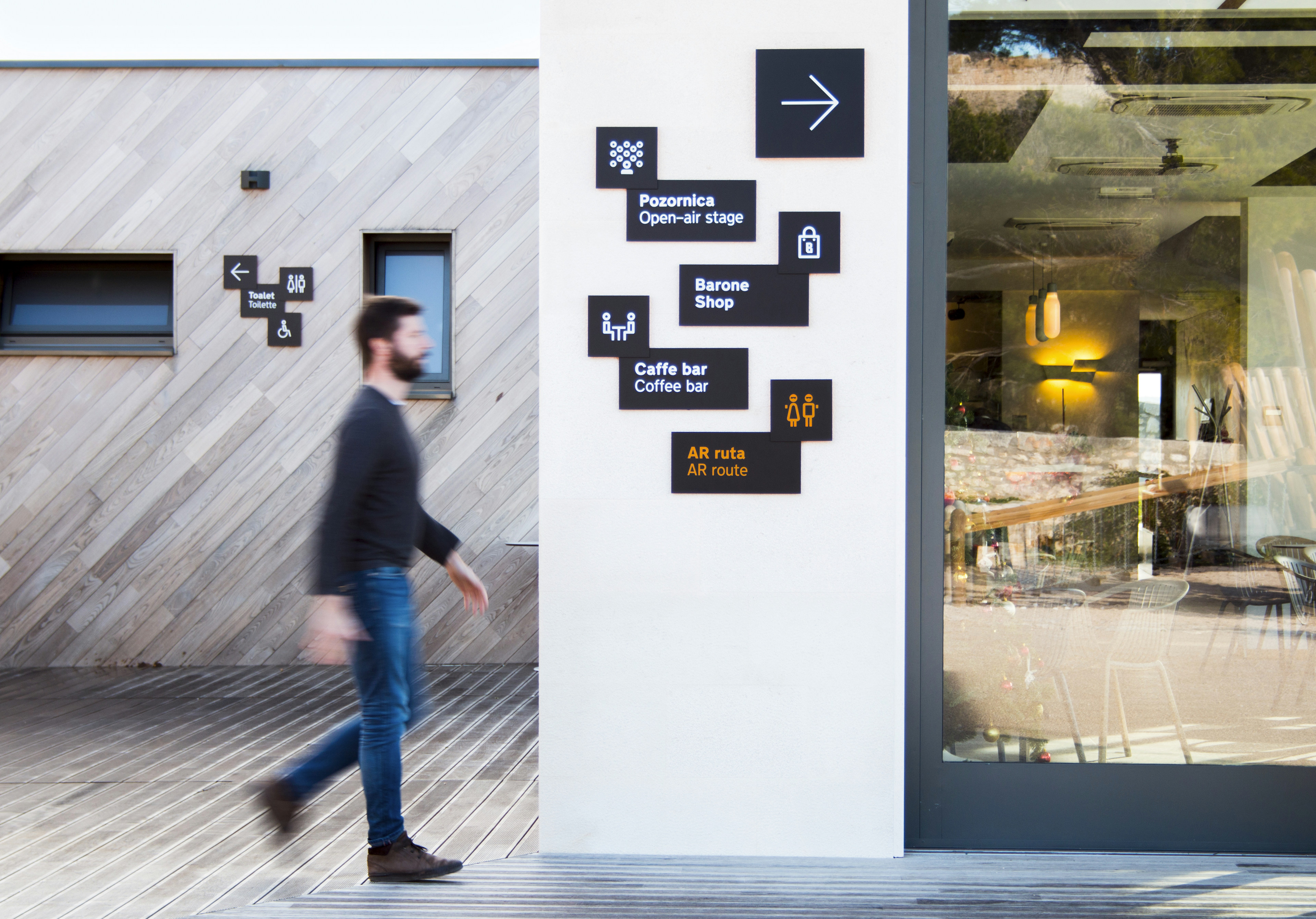
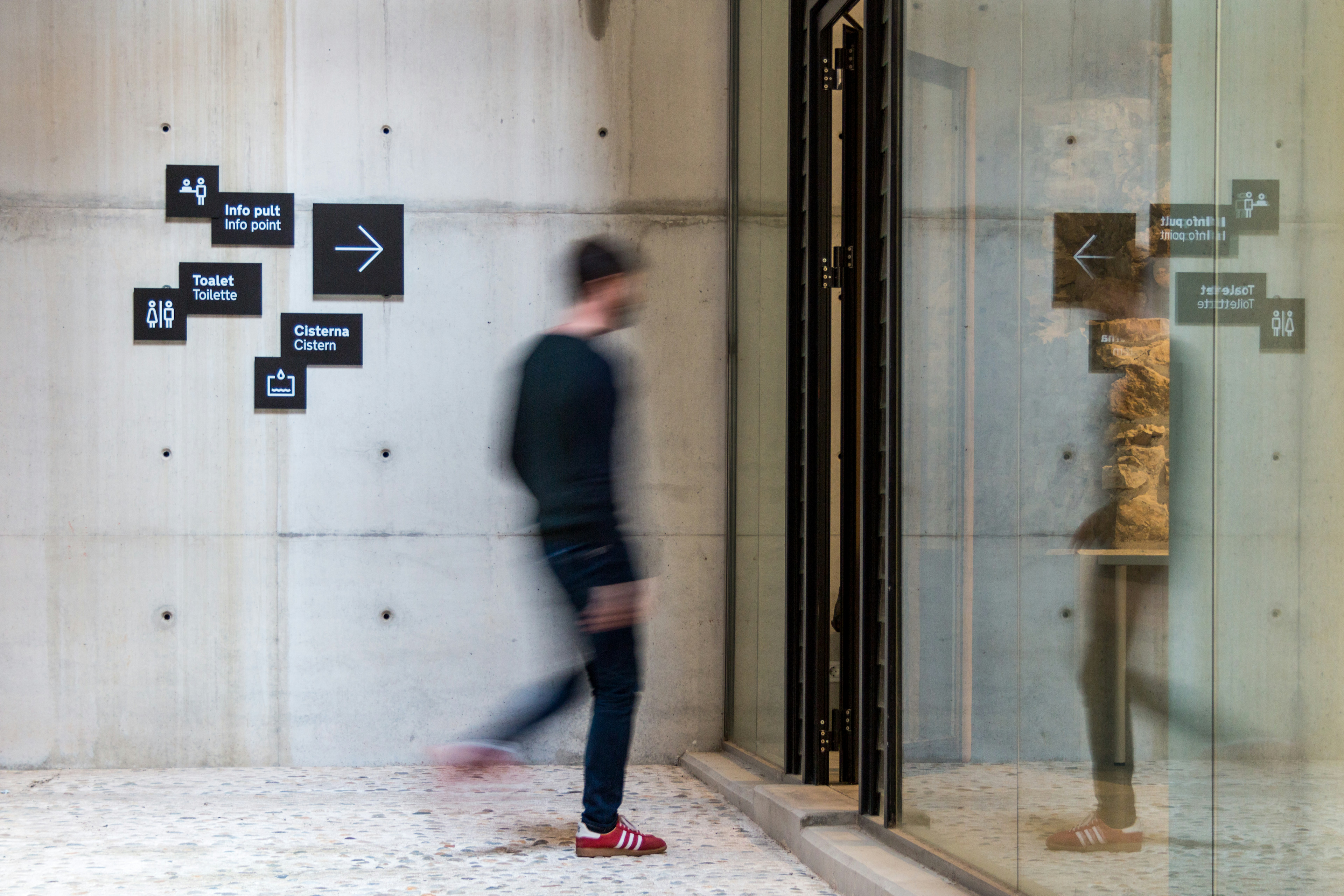
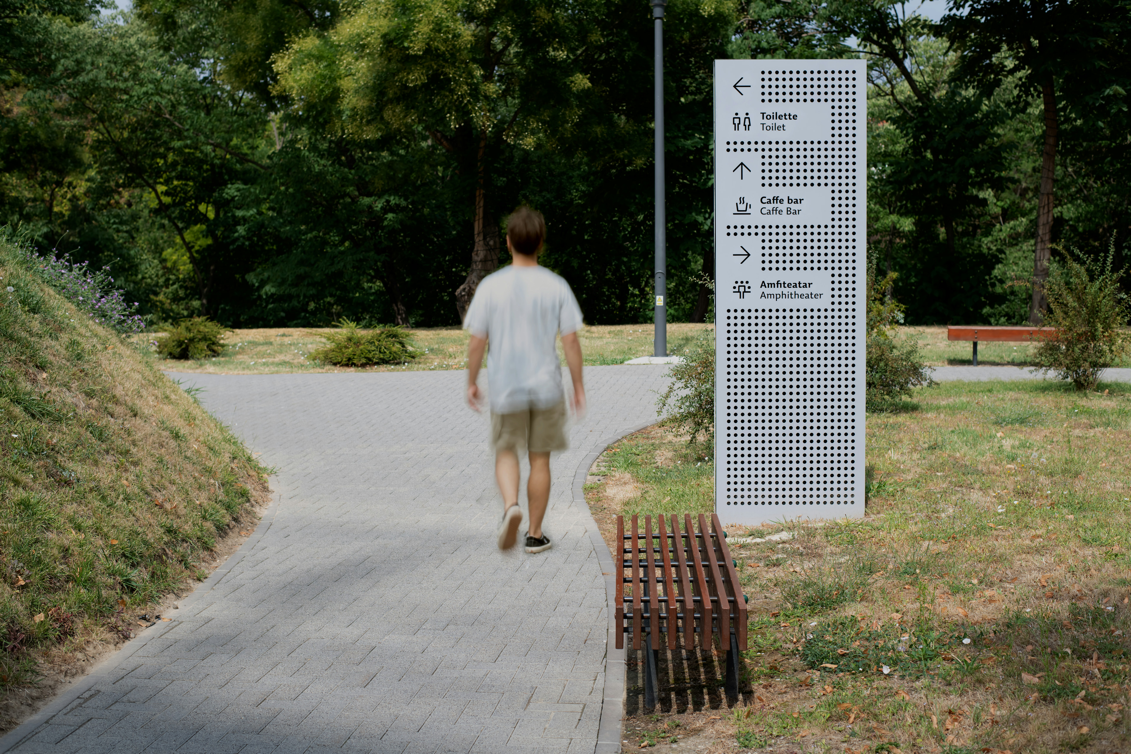
The formation of the grid system was inspired by the circles from the visual identity and was the starting point for the creation of this orientation and signage system. Each sign has a given grid within which the directions of movement are shown. The grid of circles is perforated in the material, while the textual information and pictograms are directly printed on the surface. When moving past the signs, the holes (circles) on the surface create a three-dimensional feeling that visually separates two layers of information: functional and raster (visual identity).A unique set of pictograms was designed for orientation purposes; it structurally relies on the font of the visual identity.
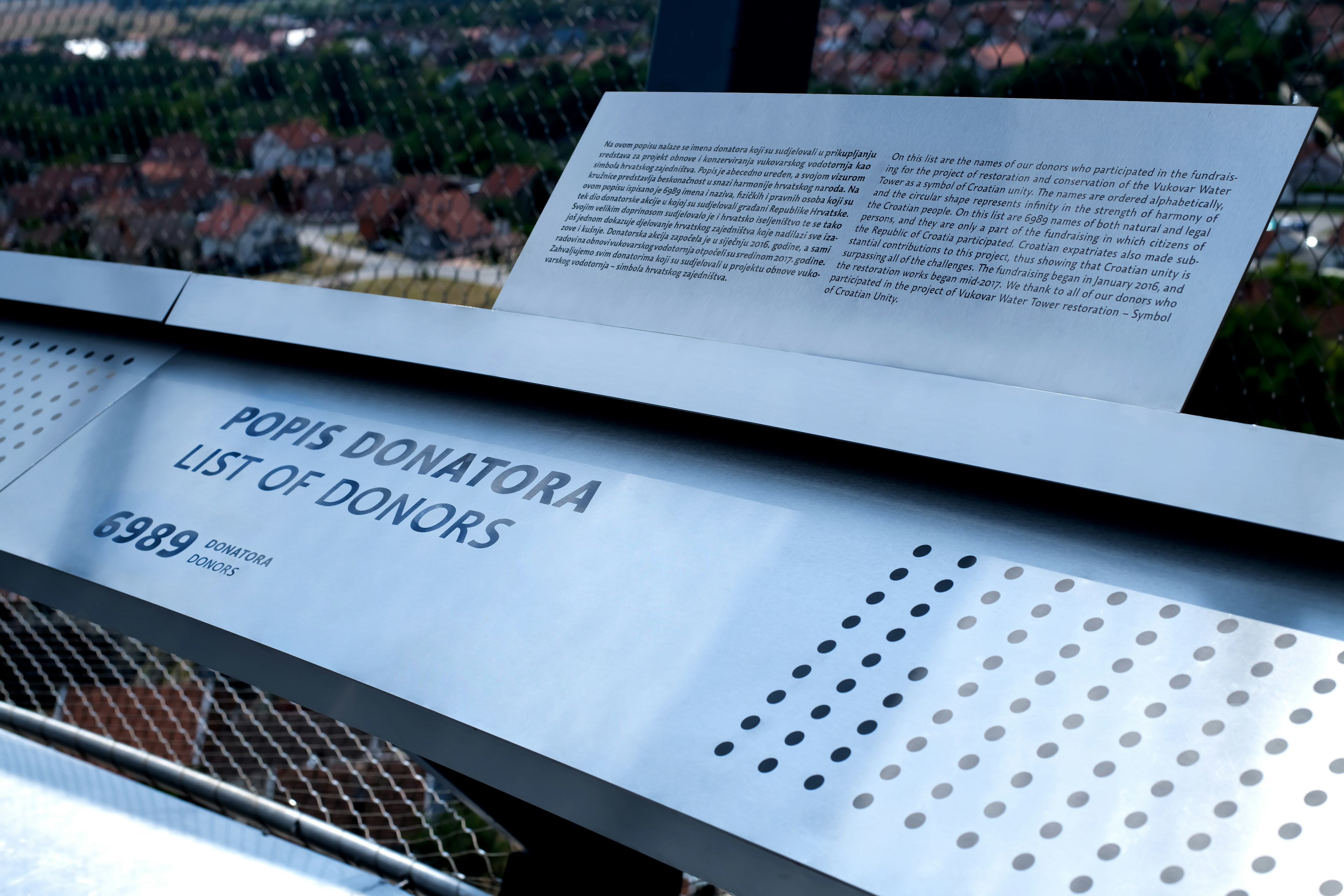
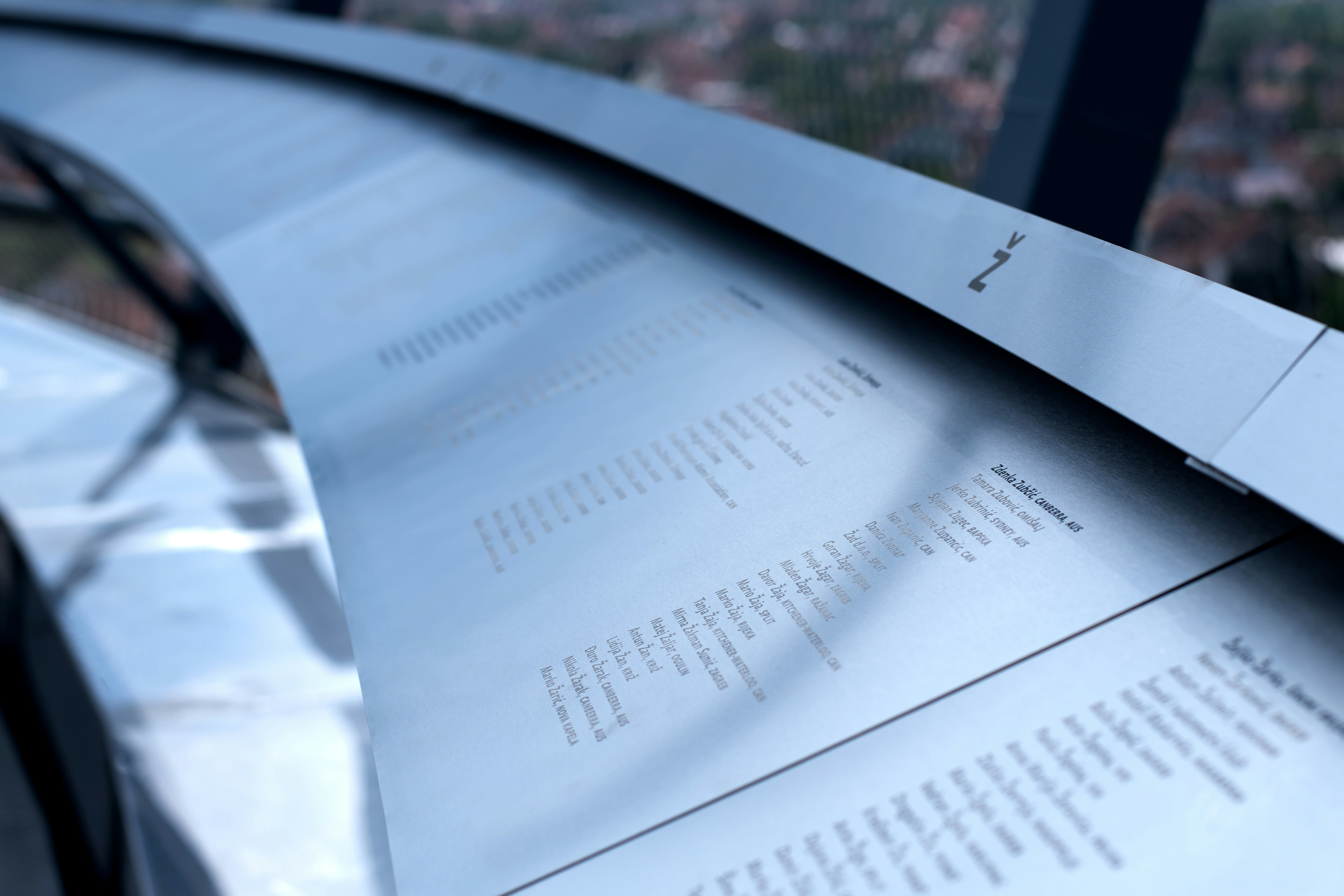
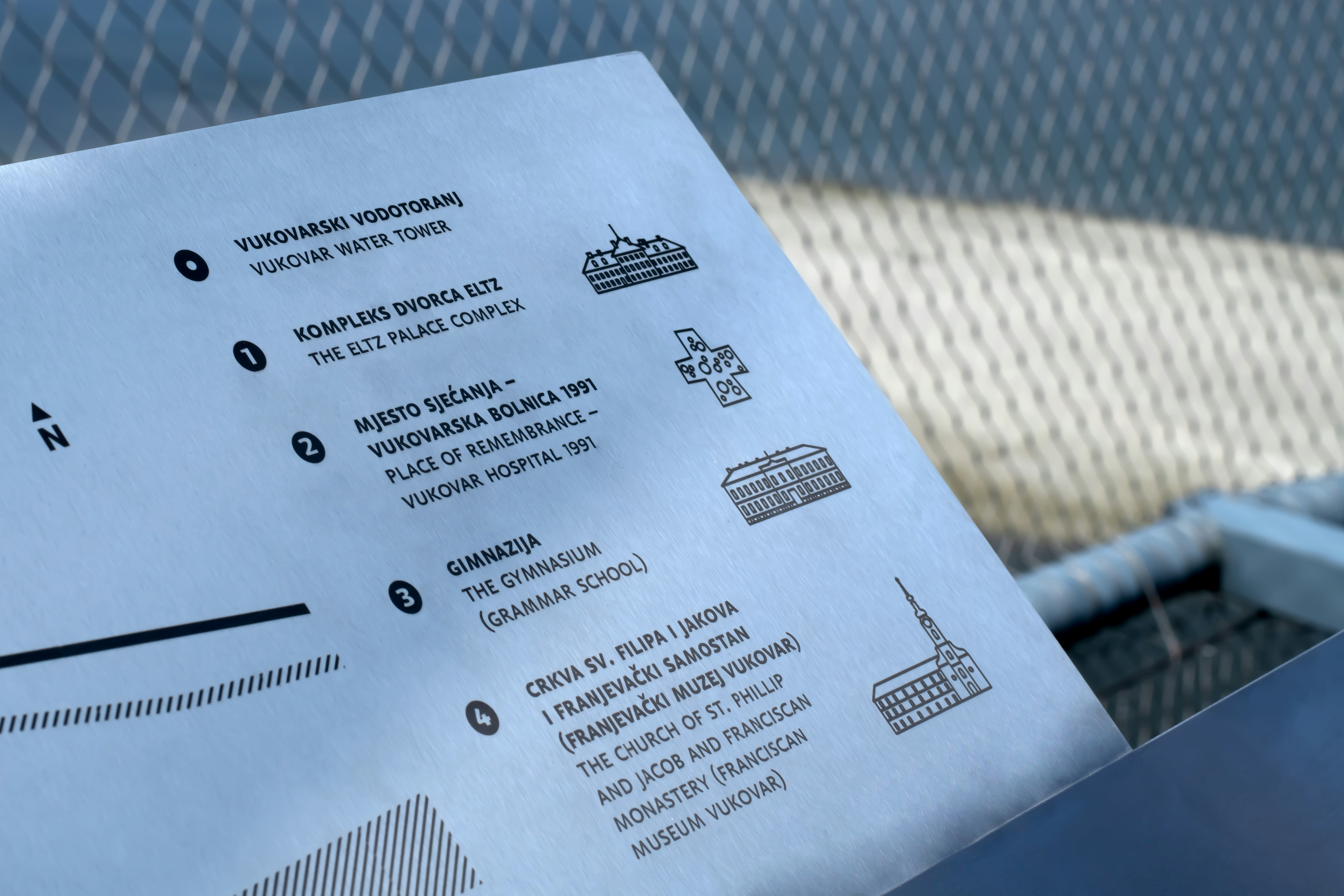
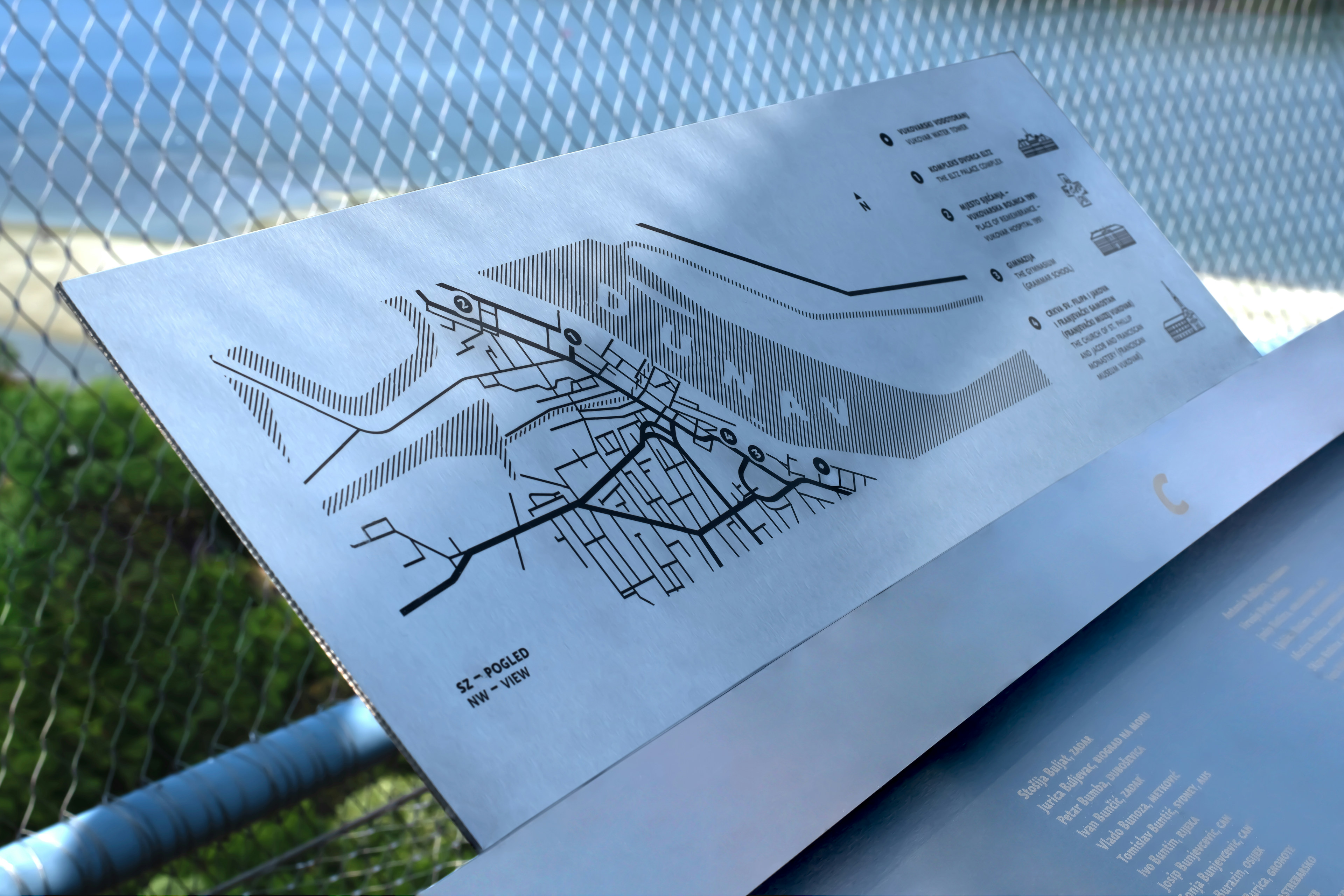
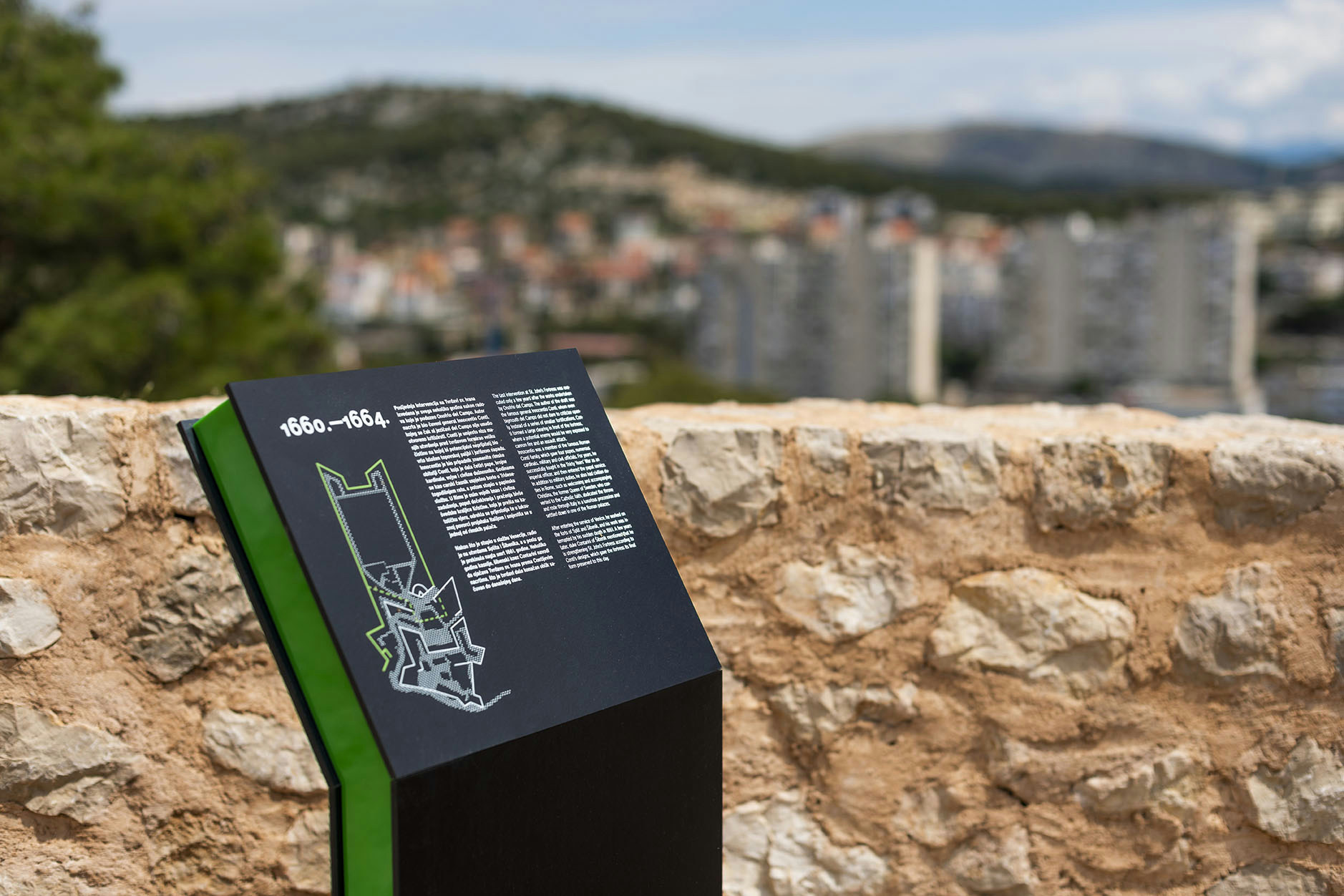
There are several lookouts at the top of the water tower; Each view is accompanied by a designed map of the area with landmarks. The large ring follows the entire diameter of the water tower and bears the names of 6,989 donors who helped make this project a reality.
- Collaborator
- Ana Bodrožić
- Exhibition design
- Vanja Ilić
- Photography
- Luce Storić
- Vukovarski vodotoranj (archives)
- Client
- Vukovarski vodotoranj
- Simbol hrvatskog zajedništva d.o.o